Preview image. Unlock full-res
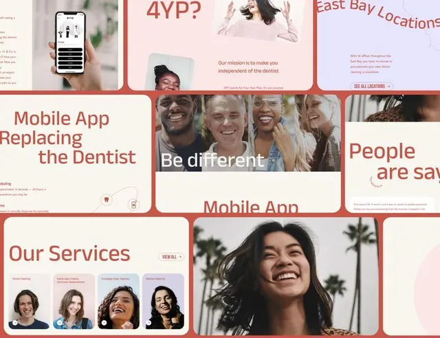
Modular grid of overlapping cards showcasing a dental app interface with coral red borders, headshots of diverse practitioners, and soft tan and blue accents.
Summary
Modular grid of overlapping cards showcasing a dental app interface with coral red borders, headshots of diverse practitioners, and soft tan and blue accents.
Visual description
Asymmetric card-based grid layout with 6-8 overlapping rectangular frames, each bounded by a coral red border. Cards contain text snippets (headings, callouts like "Be different", "Mobile App"), professional headshots of diverse individuals, and UI wireframe details like mobile phone frames showing appointment screens. A light cream background provides subtle contrast. Red text headings stand against cream cards. One large group photo spans multiple cards; smaller portrait photos are arranged in grids showing different practitioners. Typography is clean sans-serif, ranging from headlines to body copy. Soft blue and tan color accents appear in secondary cards.
Key takeaway
The asymmetric card overlap creates visual interest without complexity. Red borders unify the grid while photography of real people adds immediate trust. Mixing large focal photos with smaller supporting images balances presence and detail. The soft color palette (cream, blue, tan, red) feels modern and approachable rather than clinical.
Reuse notes
Strong template for healthcare, dental, wellness, or any professional services mobile app showcasing team or practitioner credibility. The overlapping card structure works at mobile and desktop scales. Ensure photography quality is high to match the design sophistication.
More like this




Keep what you find
A free account saves references to boards and can send you a weekly email of picks based on what you save.
To see every result, go Pro.