Preview image. Unlock full-res
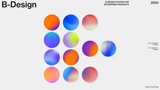
A grid of 13 gradient-filled circles in a palette system, each blending two or three hues (orange-to-blue, purple-to-yellow, pink-to-gray), demonstrating chromatic harmony and color transition principles.
Summary
A titled design system palette showing 13 gradient-filled circles arranged in rows on a light neutral background, with each circle representing a distinct color transition for a commercial product design system.
Visual description
Light gray background with black and medium-gray typography. Top-left "B-Design" wordmark, top-center header "B-DESIGN SYSTEM FOR ENTERPRISE PRODUCTS", top-right "2020". Thirteen circles arranged in three rows (5-4-4 grid pattern), each with smooth radial or linear gradient fills: orange-to-magenta, deep blue-to-cyan, pink-to-gray, purple-to-blue, purple-to-yellow-green, and muted blue-to-pink transitions. Circles overlap slightly vertically. Small color notation labels (cos, sin values) sit to the right. Bottom-right credit line "Alibaba Cloud Design".
Key takeaway
The system itself: using overlapping circular swatches to showcase and organize a palette grid. Each circle demonstrates a two-color harmony or split-complementary transition, making the palette memorable and systematic. Labeling gradients with mathematical or harmonic values suggests rigor and reproducibility.
Reuse notes
Perfect for documenting a commercial design system or creating a color-palette poster for a tech product. Works best when each circle demonstrates a specific design principle (complementary, analogous, temperature split). The circular form is more memorable than swatch strips for presentations or brand guidelines.
More like this






Keep what you find
A free account saves references to boards and can send you a weekly email of picks based on what you save.
To see every result, go Pro.