Preview image. Unlock full-res
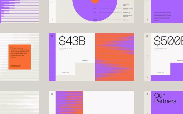
Multi-panel financial presentation layout using bright purple and coral gradients, large display numerals, and layered data visualizations for a luxury hospitality market report.
Summary
A multi-panel financial dashboard mixing bright purple gradient blocks, coral color overlays, and neutral backgrounds to present market data with large display numerals ($43B, $500B) and supporting visualizations.
Visual description
The layout spans four horizontal panels on a neutral beige background. Left panel: stacked horizontal bar chart in muted purple on white. Center-left: a large radiating circular diagram in bright purple with small text labels (budget categories) and an orange sun circle at top. Center-right: coral background with blue striped bar chart and medium-weight sans-serif figures in white. Right panel: purple background with body copy and a nested white card. Throughout, the design uses bold color blocking (purple, coral, blue, white) and generous internal spacing. The typography combines display-weight sans-serif for figures with smaller sans-serif for labels and legend text. Text remains legible despite the color density.
Key takeaway
The use of complementary color blocks (purple/orange) to separate distinct data sections without using divider lines. The layering of white cards and text on colored backgrounds creates visual containment. Radiating circular diagrams can organize category hierarchies more compactly than linear lists.
Reuse notes
Ideal for financial, market research, or investor-deck presentations where you need to present multiple data sets on one page. Works best when the color pairing is intentional and tied to brand identity (fintech often pairs purple with warm accents). Avoid text-heavy copy blocks in these bright backgrounds; reserve white cards or panels for readable body text.
More like this




Keep what you find
A free account saves references to boards and can send you a weekly email of picks based on what you save.
To see every result, go Pro.