Preview image. Unlock full-res
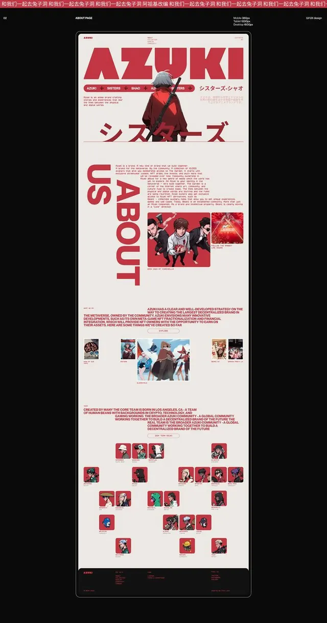
Anime community website layout with bold red typography, character photography, and grid-based content organization on neutral background.
Summary
Metaverse brand about page combining bold red typography, anime character photography, and structured editorial grid layout to communicate community identity and project roadmap.
Visual description
Cream background with black and red as the primary contrast pair. Large bold red headline "AZUKI" at top with horizontal navigation in red tabs and pill-shaped buttons (AZUKI, SISTERS, SHAO, AD, IFERS). A full-bleed anime character illustration dominates the upper third, wearing red tones. Below the fold, large red letter forms spell "ABOUT" vertically, accompanied by red body text and three horizontal photo strips showing character artwork and abstract imagery. A lower section displays a grid of small square character/community cards in alternating red, blue, and neutral palettes, arranged in loose rows. Japanese katakana text (シスターシーオ) appears as secondary branding. Minimal layout with strong typographic hierarchy and intentional white space.
Key takeaway
The use of a single bold color (red) combined with typography scale as the primary design driver, reducing reliance on color variation. The vertical typographic composition ("ABOUT" as stacked letters) creates dynamic visual rhythm while maintaining readability. The character grid at bottom scales from full-width presentation to small thumbnail cards, showing depth and project evolution.
Reuse notes
Excellent template for community-driven brands, gaming, anime, or metaverse projects. The red-and-cream palette reads as approachable and energetic without being childish. Strong navigation hierarchy supports complex information architecture. Character-heavy imagery strategy works best when the source material is visually compelling and consistently styled. Works at desktop and mobile breakpoints but benefits from generous breathing room around text.
More like this


Keep what you find
A free account saves references to boards and can send you a weekly email of picks based on what you save.
To see every result, go Pro.