Preview image. Unlock full-res
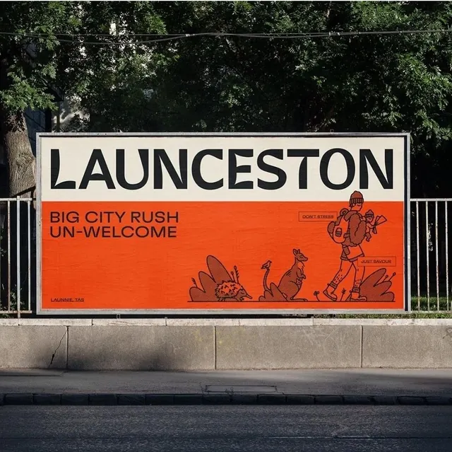
Public-information billboard for Launceston paired with a stark orange band and illustrative doodles warning against inner-city rush mentality.
Summary
Public-information billboard for Launceston paired with a stark orange band and illustrative doodles warning against inner-city rush mentality.
Visual description
A rectangular street billboard mounted on a pale concrete wall behind a metal guardrail. The top half displays "LAUNCESTON" in bold, all-caps sans-serif black type on a white ground. Below, a vibrant orange band spans the full width with the message "BIG CITY RUSH UN-WELCOME" in black condensed caps. Below the text, a collection of thin line-drawn figures depicts running, jumping, and chaotic motion doodles in dark brown or black ink. The contrast between clean sans-serif type and organic, sketch-like illustration creates tension that reinforces the cautionary message. Trees and natural landscape are visible behind the sign.
Key takeaway
Pairing bold sans-serif headlines with thin-line illustration on a bright accent-color band makes the message memorable and Instagram-friendly. The duality of order (typography) and chaos (doodles) visually communicates the message without text elaboration. The orange band isolates the secondary message and forces visual hierarchy.
Reuse notes
Effective for public-service announcements, urban-renewal campaigns, and social-messaging billboards. The style works well at large scale where illustrative detail reads clearly. The cautionary tone suits warnings, awareness campaigns, or anti-pattern messaging. Less suitable for commercial promotions; the assertive mood feels didactic rather than persuasive.
More like this

Keep what you find
A free account saves references to boards and can send you a weekly email of picks based on what you save.
To see every result, go Pro.