Preview image. Unlock full-res
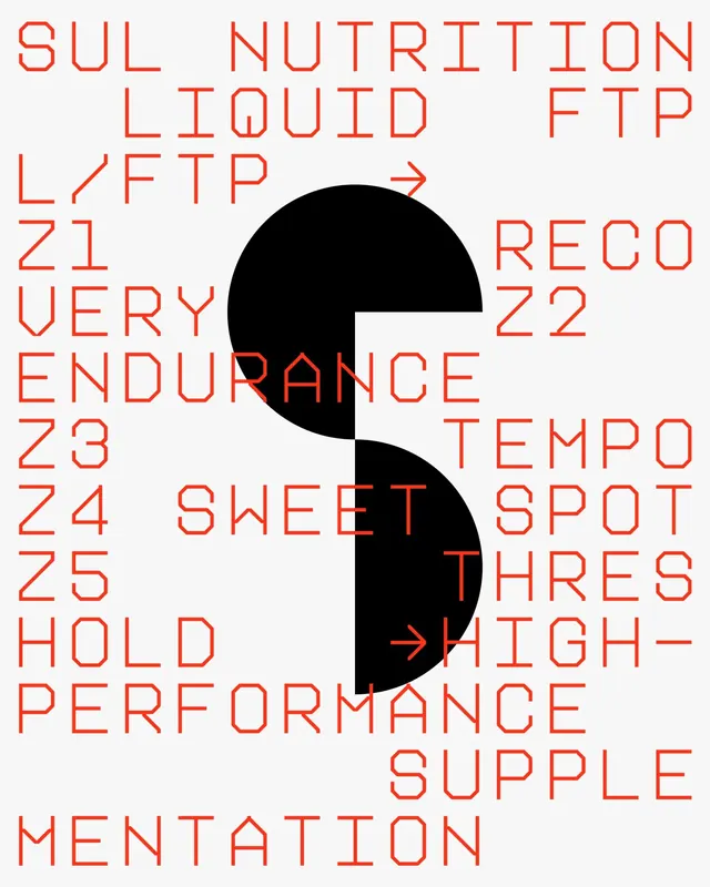
A dense, overlapping typographic layout with red-outlined sans-serif text exploring fitness, nutrition, and performance terminology.
Summary
A layered typographic composition with red outlined sans-serif letters arranged at varied angles, spelling out performance and nutrition-related terminology on a light background.
Visual description
Text elements are distributed across the frame, each letter or word rendered in red outline (stroke only, no fill) against a light off-white background. Large black shapes—circles and curved forms—sit behind the text, creating depth and visual interruption. Words like "NUTRITION," "LIQUID," "ENDURANCE," "PERFORMANCE," and numbered items (Z1, Z2, Z3, etc.) are scattered at different scales and rotations, creating a kinetic, information-dense composition.
Key takeaway
Outlined typography creates a skeletal quality that allows layering without visual chaos. The interplay of scale, rotation, and overlapping geometric forms guides the eye while maintaining readability through high contrast between red outline and light background.
Reuse notes
Effective for fitness, wellness, or data-dense editorial contexts. The outline technique works well when you need to layer type over complex imagery or shapes. Best suited to conceptual or exploratory layouts rather than straightforward messaging. Maintain sufficient contrast between outline color and background to preserve legibility at any scale.
More like this

Keep what you find
A free account saves references to boards and can send you a weekly email of picks based on what you save.
To see every result, go Pro.