Preview image. Unlock full-res
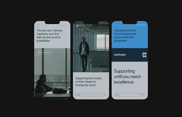
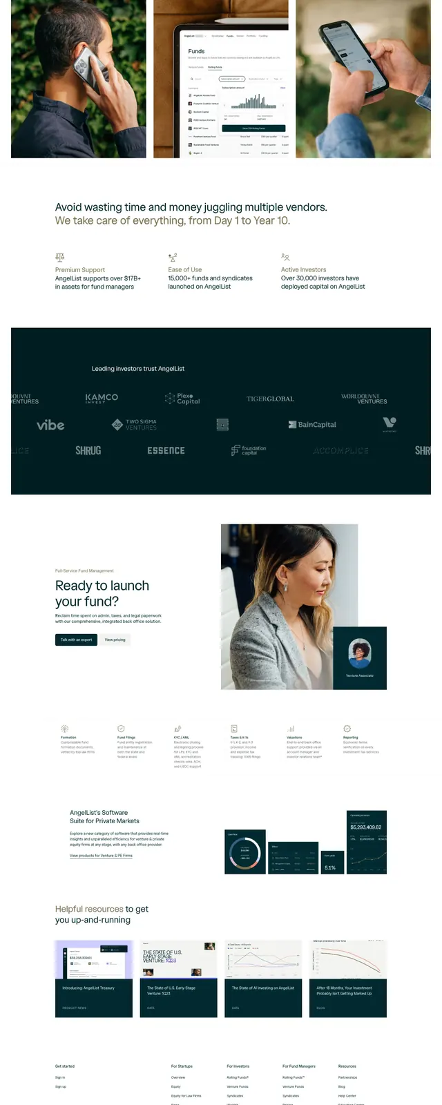
Three mobile-frame cards stacked horizontally presenting venture capital messaging with minimal white space, muted image photography, and color-blocked accent panels on dark ground.
Summary
Three mobile phone frames arranged horizontally showcase Centuries venture capital messaging on a dark field, mixing photography, text, and one bright blue accent card to convey multiple value propositions in a compact grid.
Visual description
Dark background holds three vertical phone-frame cards: left card displays a minimalist interior photograph with muted tones and a text overlay reading "The next door Venture looks possible when it also into the world of possibilites"; center card shows a workplace scene with copy below ("Supporting the crazies on their mission to change the world"); right card has a bright cobalt-blue panel at top ("We believe that the best companies have the best tech to partners") with "Centuries" logo, followed by a light gray panel reading "Supporting untill you reach excellence." All cards feature thin sans-serif type on white or gray grounds, with understated hierarchy and generous negative space suggesting premium positioning.
Key takeaway
The three-card horizontal rhythm creates visual rhythm and parallel messaging structure without repetition. Using one bold color accent (blue card) punches through the otherwise neutral palette and guides the eye. Phone-frame mockups anchor the designs to a tangible product context, lending credibility to abstract venture messaging.
Reuse notes
Effective for fintech, SaaS, or venture-focused landing pages that need to convey multiple competitive advantages in parallel. The dark background reads as premium and technical. Works best when each card contains distinct visual or textual information; repetitive messaging weakens the grid's impact. The oversized phone frames demand large viewport.
More like this


Keep what you find
A free account saves references to boards and can send you a weekly email of picks based on what you save.
To see every result, go Pro.