Preview image. Unlock full-res
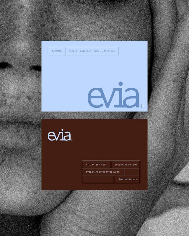
Paired business cards for skincare brand using periwinkle and chocolate brown with restrained sans-serif wordmark and contact grid.
Summary
Paired business cards for skincare brand using periwinkle and chocolate brown with restrained sans-serif wordmark and contact grid.
Visual description
Front card in soft periwinkle with the word "evia" centered in a medium-weight sans-serif mark, accompanied by the tagline "simple, balanced, pure, effective" in pale all-caps. Back card in deep chocolate brown with the evia wordmark again, below which sit the contact details: phone number, website (eviaskincare.com), email, and social handle (@eviaskincare), all in a minimal grid layout separated by thin horizontal dividers. The grayscale woven texture beneath both cards grounds them visually. Contact type labels are minimal uppercase caps.
Key takeaway
The disciplined two-color split (one brand color per face) and the restrained contact grid layout without borders or boxes. The wordmark itself is sturdy and proportionate, filling the available space without aggression. The tagline line under the mark establishes clear typographic hierarchy and meaning.
Reuse notes
Strong reference for professional services, skincare, wellness, or beauty brands seeking restraint over detail. Works well in email signatures and personal networking. The brown-and-periwinkle pairing reads as both sophisticated and approachable. Responsive to card stock textures; the design benefits from tactile production choices.
More like this






Keep what you find
A free account saves references to boards and can send you a weekly email of picks based on what you save.
To see every result, go Pro.