Preview image. Unlock full-res
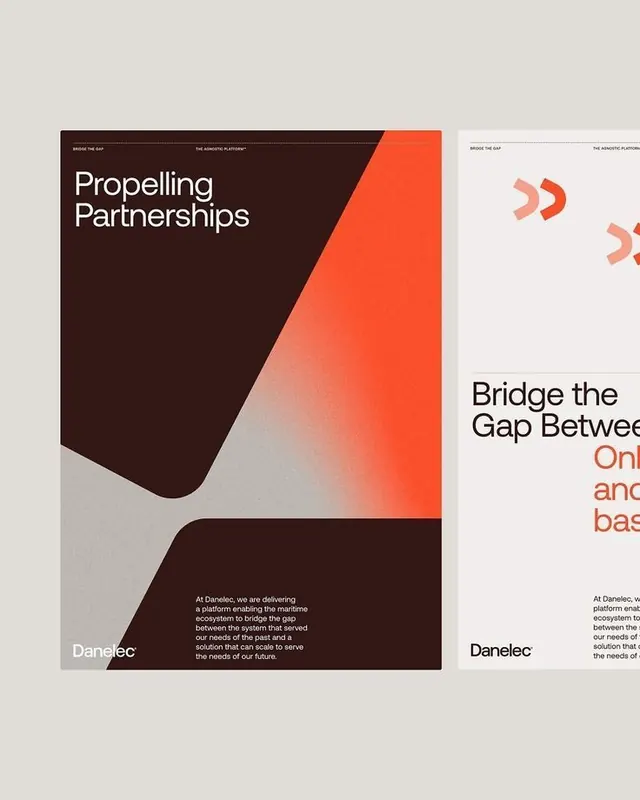
Danelec brand system combining angular geometry with organic curves, dark brown and vibrant coral in asymmetrical layouts with minimal sans-serif type.
Summary
Danelec brand system combining angular geometry with organic curves, dark brown and vibrant coral in asymmetrical layouts with minimal sans-serif type.
Visual description
A multi-panel corporate identity showing diagonal asymmetry as the organizing principle. Left side: dark brown angled rectangle with white "Propelling Partnerships" headline and body copy, anchored by the Danelec wordmark in bottom-left corner, gray neutral background. Center and right: repeated coral-orange geometric shape (right-pointing chevron/arrow) fading from bright coral at top to light gray at bottom, demonstrating the color system. The whole composition uses a diagonal cut-off separating dark and light zones, with organic rounded forms softening the geometric edges.
Key takeaway
The asymmetrical diagonal division creating forward momentum without conventional centering. The organic curves bracketing sharp geometry (angles + rounded forms in tension). Dark/light contrast amplified by warm coral against cool browns and neutrals, making the palette cohesive rather than garish.
Reuse notes
Strong for B2B / technology sector brands needing dynamism without chaos. Works well for partnership or forward-looking positioning. The diagonal can feel dated if overused; pair with generous whitespace and clean sans-serif to keep it contemporary.
More like this







Keep what you find
A free account saves references to boards and can send you a weekly email of picks based on what you save.
To see every result, go Pro.