Preview image. Unlock full-res
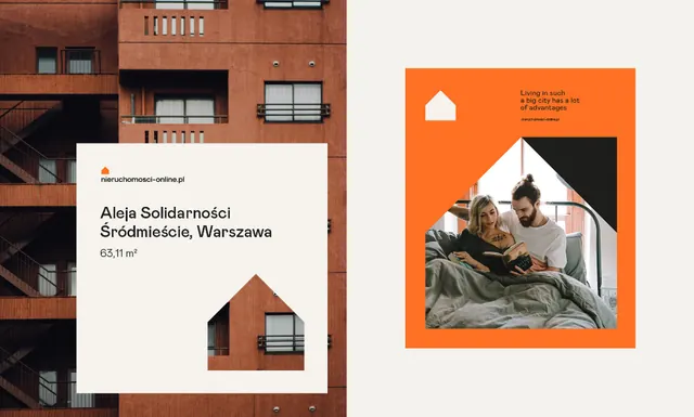
Print design pair for a Warsaw real-estate brand using a burnt-orange palette, geometric house silhouettes, and bold sans-serif typography.
Summary
A visual identity for a Warsaw real-estate property, shown on a business card and poster, using a burnt-orange background, cream off-white type, and a geometric house icon split into layered triangles.
Visual description
The left side shows a business card laid over a brick-facade photograph. The card features a rust-orange brick icon (a house broken into geometric layers) with a center dark triangle, above the name "Aleja Solidarnosci", location "Sredmiescie, Warszawa", and property size "651 m2" in dark sans-serif. The right side displays a matching poster with the same burnt-orange field filling the entire background, the house icon repeated in the top-left corner, and a lifestyle photograph of two people in an interior setting positioned in the center-right, bounded by a black diagonal shape. Cream-colored body text sits above the image. Both pieces maintain strict geometric alignment and rely on the warm orange-to-cream contrast for legibility.
Key takeaway
The house-icon system works as both a brand mark and a compositional anchor across formats. Breaking the icon into layered triangles adds depth without abandoning flatness. Using a single vibrant background color (burnt orange) across both collateral creates immediate brand consistency while the off-white typography ensures readability.
Reuse notes
Strong reference for real-estate or property-management brands needing a modern, confident identity. The geometric house motif is immediately recognizable and scales from business cards to large-format posters. Works well paired with photography to ground the abstraction in livable space.
More like this

Keep what you find
A free account saves references to boards and can send you a weekly email of picks based on what you save.
To see every result, go Pro.