Preview image. Unlock full-res
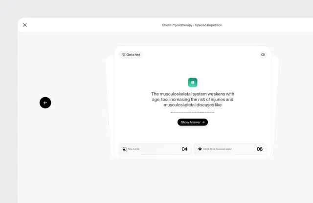
Educational app interface for a medical flashcard quiz, showing a single question card with teal accent button, progress counters, and navigation controls.
Summary
Educational app interface for a medical flashcard quiz, showing a single question card with teal accent button, progress counters, and navigation controls.
Visual description
A light gray background hosts a centered white card containing a quiz question about musculoskeletal system aging. The card title reads "Chest Physiotherapy - Spaced Repetition" in dark gray at the top. The question text is centered with a teal rounded-square icon, followed by a black primary button labeled "Show Answer" with a right arrow. Footer elements display progress as two stat blocks: "New Cards: 04" and "Cards to be reviewed again: 08," each with small icon indicators. Left sidebar shows a back arrow icon on dark background; top-left has a close icon. The typeface throughout is clean sans-serif, all-caps for labels, sentence case for copy. The palette is strictly neutral (white, light gray, dark gray) with teal as the sole accent color.
Key takeaway
The spartan card-within-modal pattern: ample white space around focused question text, single primary action, and deferred secondary information (progress metrics). The teal accent acts as a visual keystroke without competing. The spaced-repetition labels (New/Review) communicate app functionality at a glance without clutter.
Reuse notes
Ideal for medical, technical, or language-learning apps where quiz pacing and spaced repetition matter. The calm, neutral palette reduces cognitive load during learning sessions. Adapt for other educational verticals; the teal accent works for any app brand needing a cool, professional tone.
More like this

Keep what you find
A free account saves references to boards and can send you a weekly email of picks based on what you save.
To see every result, go Pro.