Preview image. Unlock full-res
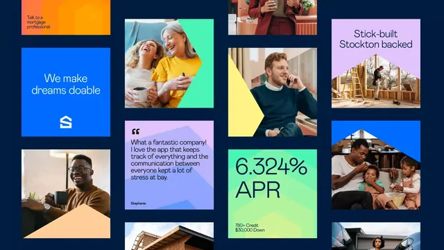
A vibrant rectangular grid of marketing cards on dark background featuring tetradic color blocks (orange, blue, lime, pink/purple) with lifestyle photography, testimonial text, metrics, and call-to-action labels.
Summary
A fintech/mortgage marketing grid of nine bright colored tiles on navy background, mixing hero text blocks, lifestyle photography, customer testimonials, APR rates, and trust messaging.
Visual description
The layout is a 3x3 grid of modules on a dark navy background, each module a distinct bright solid color or photographic inset. Upper-left: bright orange tile with dark text "Talk to a mortgage professional." Below that: electric-blue tile with white sans-serif "We make dreams doable" and a house-icon symbol. Left-middle: beige/tan tile with photograph of a man with glasses holding a cup. Center-top: a photo of two women laughing (one in bright yellow shirt) on bright lime-green background. Center-middle: lavender/purple tile with a customer quote in sans-serif and name "Stephanie" in smaller type. Center-bottom: lime-green tile with large bold "6.324% APR" and fine print "780+ Credit / $30,000 Down". Right column features lifestyle photography: professional woman in burgundy (top), man on phone in front of yellow wall (middle), family with children on beige background (bottom), construction site framing (top-right), and partial car window (bottom-right). The color palette alternates warm (orange, yellow, beige) and cool (blue, cyan, purple) to signal energy and trust simultaneously.
Key takeaway
The tetradic color blocking creates visual hierarchy without hierarchy of importance, allowing equal weight to emotional messaging, testimonials, and hard metrics. Mixing photography directly into color blocks (no frames, bleeds at edges) feels contemporary and space-efficient. The rhythm of photograph, text block, photograph across rows maintains visual interest in a dense grid.
Reuse notes
Ideal for fintech/mortgage/lending landing pages where you need to layer reassurance (testimonials, rates), emotional appeal (lifestyle photography), and clear CTAs without feeling cluttered. The tile approach works well for responsive design (tiles reflow on mobile). Avoid if brand voice is minimalist or luxury; the saturation reads as energetic and accessibility-focused, not premium.
More like this




Keep what you find
A free account saves references to boards and can send you a weekly email of picks based on what you save.
To see every result, go Pro.