Preview image. Unlock full-res
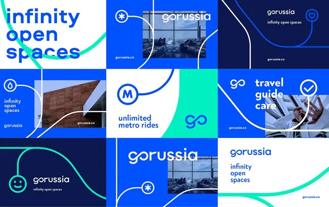
Vibrant brand identity for Gorussia featuring a modular grid layout with bright cyan, royal blue, and navy elements connected by flowing curves and geometric iconography.
Summary
A cohesive brand identity system for Gorussia that combines a modular grid layout with flowing curves and service-specific modules in bright cyan, royal blue, and navy.
Visual description
Nine-cell grid composition with alternating rectangular and square blocks in white, royal blue, and navy backgrounds. Each cell contains service messaging (infinity open spaces, unlimited metro rides, travel guide care) paired with photography, iconography, or solid color fills. Flowing organic curves in bright cyan connect across grid boundaries, breaking the rigid structure. Icons include circular device symbols with asterisks, infinity marks, and smiling emoji in white or cyan. Photography shows interior spaces and architectural details. Sans-serif white typography uses clear hierarchy for headings and descriptive text. The overall effect balances geometric precision with organic flowing lines.
Key takeaway
The technique of using fluid curves as connectors across a rigid grid creates visual rhythm and breaks mechanical severity. The color blocking (white, navy, blue) with bright cyan accent line commands attention without saturation. Pairing specific service modules with either photography or solid color maintains visual variety while keeping the system cohesive. The icon set (simple line-based circles and marks) feels contemporary and scalable.
Reuse notes
Excellent template for tech, mobility, or service-based brands needing modular messaging across a single layout. The grid structure accommodates multiple service teasers, making it ideal for platforms offering multiple features. The cyan/blue palette reads as modern and trustworthy for transportation or logistics. The flowing-curve connector technique works across digital and print contexts.
More like this





Keep what you find
A free account saves references to boards and can send you a weekly email of picks based on what you save.
To see every result, go Pro.