Preview image. Unlock full-res
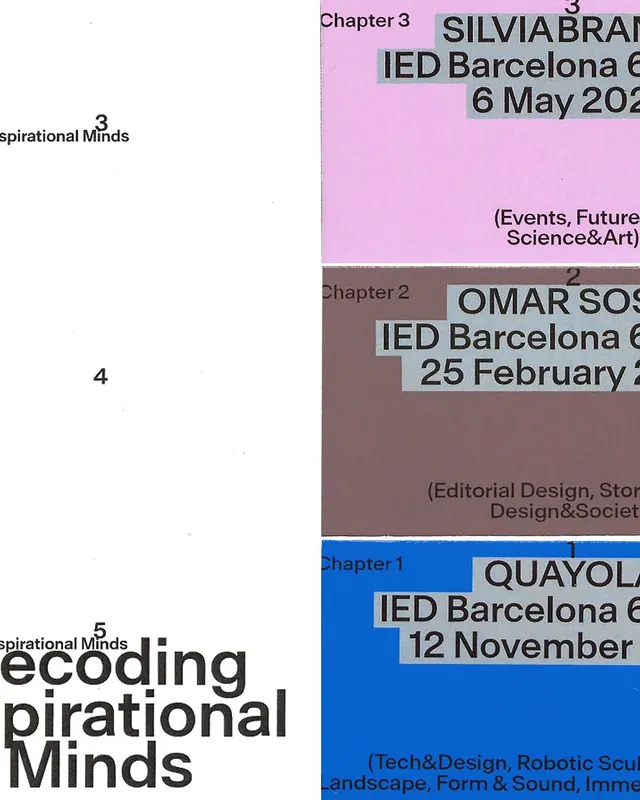
Publication divider design stacking three color-coded chapters with speaker names, event details, and topic labels on bold pastel backgrounds.
Summary
Stacked publication dividers using distinct saturated colors to separate three chapters, each labeled with a speaker name, institution, date, and topic category.
Visual description
Three horizontal sections stack vertically, each occupying roughly one-third. Top section: bright pink background with "Chapter 3", speaker name in dark type (SILVIA BRANDI), institution and date in a pale gray box, and topic categories bottom-right. Middle section: dusty mauve-brown background with "Chapter 2", different speaker (OMAR SOS), matching information layout, and aligned topic labels. Bottom section: vibrant cobalt blue background with "Chapter 1" (visible lower), speaker name QUAYOLA in dark sans-serif, date/event details, and topic descriptors. All sections use consistent typography hierarchy and information block positioning, with gray-tinted text boxes providing subtle contrast. Left margin shows section numbers (3, 2, 1) in light type.
Key takeaway
Color-blocking sections creates instant visual taxonomy without extra graphics. Pastel-on-bright-background contrast keeps text legible while allowing bold hue variety. Consistent information hierarchy across variant backgrounds demonstrates reliable layout discipline.
Reuse notes
Effective for conference catalogs, exhibition programs, or any multi-category publication needing quick visual distinction. Works well in print (thick paper shows color intensity) and digital. Information-dense layout suits educational or curatorial contexts.
More like this




Keep what you find
A free account saves references to boards and can send you a weekly email of picks based on what you save.
To see every result, go Pro.