Preview image. Unlock full-res
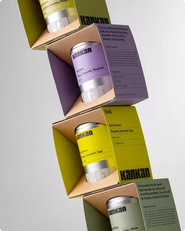
Multi-product skincare set stacked vertically, pairing earthy brown-kraft card with color-coded product bands in muted olive, sage, and plum tones.
Summary
A multi-product skincare line arranged in a diagonal stack, using earthy kraft-paper boxes offset with saturated colored product bands (olive, plum, sage, yellow) and matching bottle labels, anchored by product description cards in muted tones.
Visual description
Four cylindrical bottles with frosted-metal tops and kraft-paper collars stack diagonally across the image. Each sits in a brown corrugated carton with a branded color band: deep olive at top, muted purple-gray in the middle-upper, bright yellow in the middle-lower, and soft sage at the bottom. Beside the second and fourth bottles sit product description cards in matching colors (purple and green) with small product imagery and body copy. The typeface is a clean sans-serif in dark gray or black; the overall palette merges warm neutrals (kraft brown, cream) with a carefully curated set of natural-looking color accents.
Key takeaway
The color-blocking system using saturated but muted tones (olive, plum, sage, yellow-gold) to differentiate products without clashing. The kraft-card base keeps it cohesive and earthy; the info cards repeated beside select products create visual rhythm and anchor the composition. Simple, legible sans-serif type that reads instantly even at a glance.
Reuse notes
Strong for premium skincare, apothecary, or wellness brands. The diagonal arrangement works well in lifestyle layouts. Pairs naturally with earthy photography or botanical illustrations. Works best when the number of products is three to five, so each color stands out distinctly.
More like this

Keep what you find
A free account saves references to boards and can send you a weekly email of picks based on what you save.
To see every result, go Pro.