Preview image. Unlock full-res
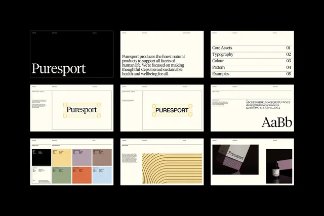
Comprehensive branding system for wellness brand using cream, charcoal, warm neutrals, and muted earth tones across identity, collateral, and color/pattern exploration.
Summary
Puresport brand identity system showcasing business cards, letterhead, logotype treatments, color palette swatches, striped patterns, and photographic applications on a dark background layout grid.
Visual description
Grid layout of nine elements on black background. Top row: logotype lockup with description text, business card front, and specifications sheet. Middle row: three variations of business card and letterhead applications with "Puresport" wordmark in different orientations and sizes. Bottom row: curated color-palette swatch blocks in cream, warm gray, and olive; a horizontal ruled-line pattern in muted ochre; and monochromatic photographic treatments of objects against the brand colors. Typography is clean sans-serif throughout. The overall palette restricts to cream, charcoal, warm neutrals, and muted earth tones, with no vibrant color.
Key takeaway
The restrained earth-tone palette conveys trustworthiness without relying on primary colors. The pattern-exploration row (bottom-left) shows how to extrapolate secondary elements from core colors. The photographic applications (bottom-right) demonstrate how the brand language scales from collateral to imagery without losing coherence.
Reuse notes
Excellent reference for healthcare, wellness, or premium b2b brands avoiding loud color. The horizontal rules and spacing are generous, lending breathing room typical of luxury corporate design. Works best paired with photography of products, materials, or environments. The monochrome hierarchy makes it suitable for low-color applications (stamping, foil, emboss).
More like this






Keep what you find
A free account saves references to boards and can send you a weekly email of picks based on what you save.
To see every result, go Pro.