Preview image. Unlock full-res
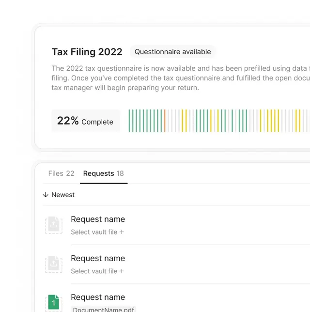
Tax software interface showing a questionnaire prompt with a 22% progress bar rendered as aligned vertical lines in green and yellow.
Summary
A fintech form interface showing a tax questionnaire prompt with a 22% completion indicator rendered as a grid of aligned vertical bars in green and yellow.
Visual description
Light gray rounded card container on a white background. Bold black headline "Tax Filing 2022" followed by gray subheading "Questionnaire available" in sans-serif. Body text in gray explains the prefilled questionnaire and next steps, left-aligned. Below the text, "22% Complete" label sits left-aligned, followed by a data visualization: roughly 24 vertical lines in a tight grid, about one-third colored in green, the rest in yellow, with gaps between line groups creating subtle sectioning. Below the visualization, a second card with tabs: "Files 22" (gray) and "Requests 18" (bold, active). A list of three entries labeled "Request name" with sub-copy "Select vault file +" in light gray, and one entry with a green numbered badge "1" and "DocumentName.pdf" shown. Whitespace and typography hierarchy guide the eye downward through the form.
Key takeaway
The vertical-line progress visualization is instantly readable and more visually interesting than a traditional horizontal bar; the color split (filled vs. unfilled) works even in peripheral vision. The card-and-whitespace layout breaks a long form into digestible sections. The subtle tab affordance (weight change, bottom border) and file-list styling with icons create clear information hierarchy without loud visual elements.
Reuse notes
Ideal for fintech, productivity, and SaaS onboarding flows where users need encouragement and clarity on progress. The neutral color palette (white, gray, muted green/yellow) maintains professionalism without distraction. Works well for tax, accounting, or document-processing UIs. The card-and-spacing approach adapts well to mobile screens.
More like this





Keep what you find
A free account saves references to boards and can send you a weekly email of picks based on what you save.
To see every result, go Pro.