Preview image. Unlock full-res
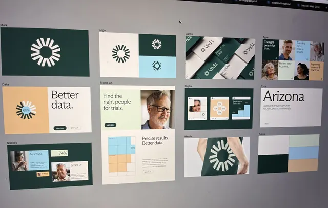
Comprehensive brand guidelines mockup featuring a circular logo mark, color palette (dark green, cream, teal accents), typography scales, business cards, website layouts, and data visualization templates.
Summary
A structured brand guidelines presentation showing logo development, color system (dark green, cream, teal), typography hierarchy, application templates including business cards and website mockups, and data-visualization patterns for a healthcare or clinical analytics brand.
Visual description
Grid layout displaying multiple brand system components: dark green rectangular mark containing a stylized white circular icon at top-left; logo variations in black, white, and color on cream and light blue grounds; business cards with logo, teal accent stripe, and typographic hierarchy; website layout mockup showing hero section with green background and cream text; portrait photography of professionals in upper-right corner; data visualization mockup with orange and teal accent colors; color palette swatch section at bottom showing teal, green, dark charcoal, and cream. All typography rendered in clean sans-serif with generous spacing and modern proportions.
Key takeaway
The constrained, sophisticated color palette (dark green anchoring, cream for breathing room, teal for accent) that reads both professional and approachable. The modular brand component grid showing logo, color, type, and applications all at once. The restrained use of one secondary color (teal) alongside two neutrals creates visual cohesion without excess.
Reuse notes
Strong template for healthcare, wellness, analytics, or any professional-services brand. The dark green and cream pairing conveys stability and trust; add teal when you need a warm accent without clashing. Works particularly well for B2B platforms and SaaS onboarding flows that need analytical credibility.
More like this

Keep what you find
A free account saves references to boards and can send you a weekly email of picks based on what you save.
To see every result, go Pro.