Preview image. Unlock full-res
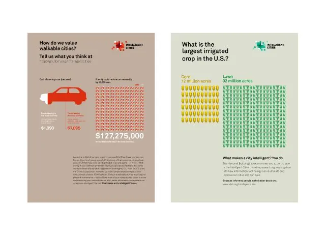
Two-panel infographic comparing US urban car culture and crop acreage using icon grids and stacked metrics on muted tan and sage backgrounds.
Summary
Two complementary infographics side by side comparing US transportation and agricultural data through icon repetition and large metric callouts on contrasting neutral backgrounds.
Visual description
Left panel on warm tan background: "How do we value valuable cities?" with a red car icon and statistics below ($1,390 car cost, $7,095 car value, $127,275,000 total). Icon repeats in a grid pattern showing frequency. Body copy underneath. Right panel on pale sage background: "What is the largest irrigated crop in the U.S.?" with corn (yellow) and lawn (green) icons side by side, each repeating in grids below labeled "13 million acres" and "32 million acres." Smaller body copy follows. Both use clean, left-aligned sans-serif text in dark gray/charcoal. Generous white space surrounds content.
Key takeaway
Icon repetition (not bars or lines) communicates magnitude intuitively and feels less corporate than traditional charts. Pairing warm and cool backgrounds for side-by-side panels creates instant visual separation without dividing lines. Large, bold metrics above small explanatory text creates clear hierarchy and makes the data memorable.
Reuse notes
Effective for business reports, consulting decks, or public communication where the audience is general and engagement matters. The earthy palette and muted colors work well for environmental, agricultural, or urban topics. Icon grids scale well from print to digital and remain readable at any size.
More like this



Keep what you find
A free account saves references to boards and can send you a weekly email of picks based on what you save.
To see every result, go Pro.