Preview image. Unlock full-res
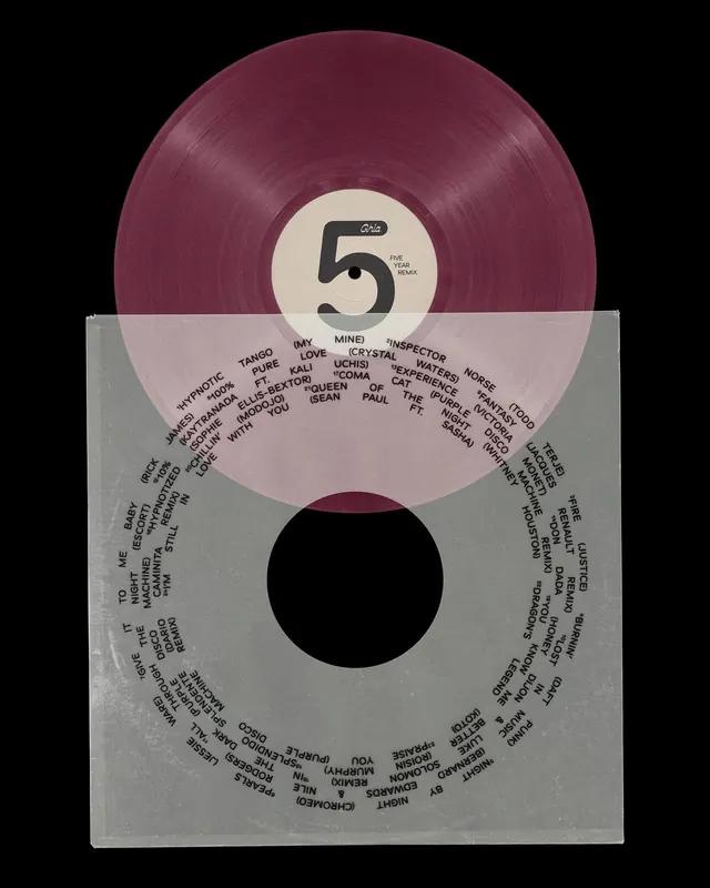
Retro vinyl-record aesthetic with a bold central number inside a cream label, surrounded by dense, circularly-arranged artist and track credits, echoing 1970s psychedelic album art.
Summary
Retro vinyl-record aesthetic with a bold central number inside a cream label, surrounded by dense, circularly-arranged artist and track credits, echoing 1970s psychedelic album art.
Visual description
The composition is dominated by a deep burgundy vinyl record at the top, its textured grooves rendered realistically. Below sits a large cream-colored circular label bearing a bold, serif-style number "5" printed in black. The lower half of the cover is a light gray background hosting a large black circle as negative space, with artist names, track titles, and credits arranged in a radial pattern around the perimeter. The typography mixes sans-serif blocky text with small, tightly-spaced handwritten-style listings, all in black, creating a densely-packed information hierarchy that reads like archival notes or liner notes. The overall effect is tactile and vintage, referencing 1970s record sleeve design.
Key takeaway
The vinyl record rendering adds authenticity and instantly communicates the music context, while the cream label with bold number serves as a clear visual anchor. The radial typographic layout is both functional and decorative, creating visual interest from typography alone. The contrast between the organic vinyl texture and the sharp geometric label design is distinctive and memorable.
Reuse notes
Perfect for music branding, record labels, or vintage music-adjacent products. The dense typographic circle works well for credits, track listings, or ingredient lists that need visual interest. Best at album or poster scale where detail is visible. The color palette (burgundy, cream, black, gray) is timeless for retro or nostalgia-driven brands.
More like this






Keep what you find
A free account saves references to boards and can send you a weekly email of picks based on what you save.
To see every result, go Pro.