Preview image. Unlock full-res
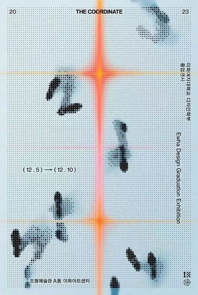
Technical grid diagram with labeled axes, halftone-rendered data points, and bright orange and red crosshairs, overlaid with multilingual text and numerical coordinates.
Summary
Technical grid diagram with labeled axes, halftone-rendered data points, and bright orange and red crosshairs, overlaid with multilingual text and numerical coordinates.
Visual description
A pale blue dot-grid background fills the field. A bright red-orange crosshair intersects at center, dividing the space into quadrants. Scattered black halftone shapes (rendered via dithering) populate each quadrant, suggesting data points or irregular geometries. Small numerical labels and handwritten annotations mark specific coordinates (e.g. "20", "23", "12.5 -> 12.10"). Vertical and horizontal dashed yellow lines form a secondary structure. Multilingual text in small serif or monospace font appears along the right edge, reinforcing the academic or research context.
Key takeaway
Halftone dithering converts solid shapes into texture, creating visual interest and a sense of precision without dense solid fills. The color-coded axes and grid provide structure that readers instinctively understand as spatial or analytical. The combination of numerical labels, handwritten notes, and multilingual text conveys authenticity and scholarly rigor.
Reuse notes
Ideal for research publications, data-science blogs, architecture presentations, or conceptual mapping work. The pale blue and orange palette feels editorial and approachable rather than sterile. Works well at small sizes (thumbnail) and when detail rewards close inspection. Pair with serif body copy for design or academic contexts; the halftone texture adds credibility to abstract claims. Note that the multilingual text and coordinates are specific to this project, so adapt the labeling to your context rather than copying verbatim.
More like this


Keep what you find
A free account saves references to boards and can send you a weekly email of picks based on what you save.
To see every result, go Pro.