Preview image. Unlock full-res
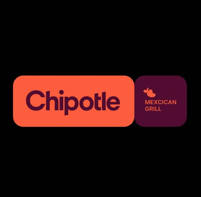
Branding system using two rounded-rectangle card blocks in bold coral and deep burgundy against black, with a wordmark and supporting identifier.
Summary
Minimalist branding system using two stacked rounded-rectangle cards in neon coral and deep burgundy, each with integrated wordmark and descriptor, set against black.
Visual description
Black background fills the entire composition. Two rounded-rectangle card blocks sit horizontally side-by-side in the center. Left card (wider, roughly 2:1 aspect) displays coral-red background (hex FD5D3E) with large bold sans-serif wordmark "Chipotle" in deep burgundy (hex 510C32). Right card (smaller, nearly square) uses the same burgundy background (hex 510C32) with a small coral pepper icon centered above centered sans-serif text reading "MEXICAN / GRILL" in coral (hex FD5D3E). Both cards have consistent rounded corner radius, clean edges, no shadows or texture. Generous breathing room between the cards. The color relationship is a warm duotone (coral and burgundy) on a null background, emphasizing the branded forms themselves as graphic objects rather than containers.
Key takeaway
The card-block system treats branding as modular graphic elements rather than locked logotypes, allowing flexible layout while maintaining strict color and geometric discipline. The duotone palette (one warm hue at two temperatures) creates visual cohesion without needing multiple colors. The pepper icon, though minimal, anchors "Mexican" conceptually without literal photography.
Reuse notes
Excellent foundation for QSR or food brands wanting to signal speed and clarity through geometric reduction. The rounded-rectangle language reads contemporary and friendly while the bold color holds premium positioning. System scales to multiple cards or a lockup; works equally well on menus, packaging, signage, or digital. Best against neutral (black, white, gray) backgrounds where the color blocks can breathe. The pepper icon is a deliberate reuse across formats.
More like this



Keep what you find
A free account saves references to boards and can send you a weekly email of picks based on what you save.
To see every result, go Pro.