Preview image. Unlock full-res
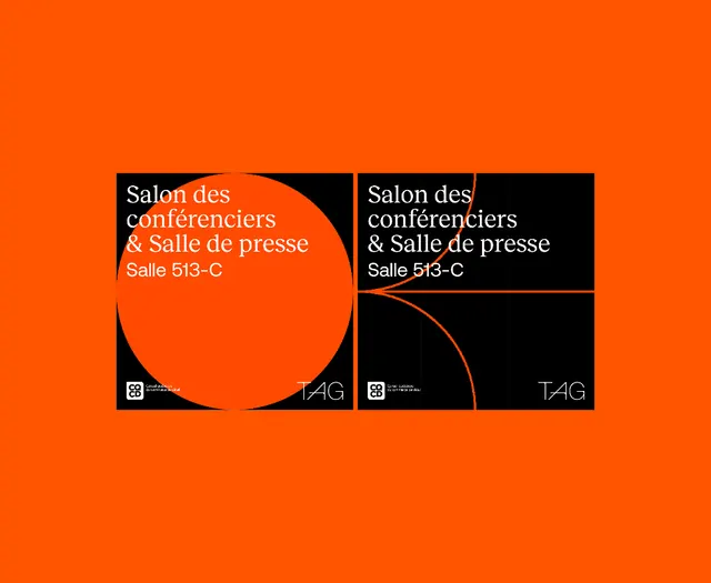
Event branding system with two-panel wayfinding cards using vibrant orange background, black type blocks, and curved geometric divider that extends across panels.
Summary
Event wayfinding system featuring two identical signage panels with white sans-serif type on black backgrounds, anchored by a vibrant orange field and unified by a continuous curved orange divider that flows across both cards.
Visual description
Two rectangular wayfinding cards centered on a vibrant orange background. Each card is dominantly black with white sans-serif type reading "Salon des conférenciers & Salle de presse" (Salon 513-C). The left panel has a large curved orange shape flowing from the black area into the orange field behind; the right panel features a matching curve that connects to it, creating a visual bridge between the two signs. At the bottom of each card, small institutional logos and branding marks (including TAG initials) appear in white. The orange background fills the entire frame, making the black-and-white cards read as a unified system. The composition balances bold simplicity with directional flow through the curved element.
Key takeaway
The continuous curved form that visually connects two separate signage components into one cohesive identity. Using a saturated orange as a unifying field that frames the modular cards. The contrast strategy of white type on black against the vibrant field for legibility in a physical space.
Reuse notes
Strong for conference, exhibition, or institutional wayfinding systems. The bold orange commands attention from a distance while maintaining type legibility. Works especially well for multi-room or multi-building signage where consistency matters. The geometric simplicity scales easily to physical materials (banners, door signs, floor graphics).
More like this







Keep what you find
A free account saves references to boards and can send you a weekly email of picks based on what you save.
To see every result, go Pro.