Preview image. Unlock full-res
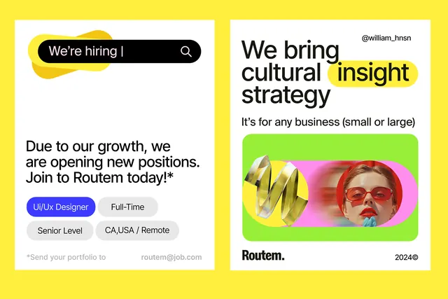
Hiring-focused graphic composition combining bold yellow-green background with white information cards and a colorful portrait photograph framed in neon pink.
Summary
A vibrant recruitment graphic layering clean white information cards and a bold neon-pink portrait frame against a bright yellow-green background, signaling openness and cultural energy.
Visual description
Bright acid yellow background (approximately hex FFEF3D) fills two-thirds of the composition horizontally. Left side features two stacked white rounded-rectangle cards: top card shows a dark rounded button labeled "We're hiring" with search icon, below is black body copy on white ("Due to our growth, we are opening new positions. Join us Routem today!"). Beneath that, a blue filled button reading "UX/UI Designer" and descriptive text: "Full-Time", "Senior Level", "CA/USA / Remote". Right side displays large black sans-serif headline "We bring cultural insight strategy / It's for any business (small or large)" with the phrase "cultural insight" highlighted in bright lime green. Below that, a tall portrait photograph in neon pink frame (approximately hex 7A3E48 background with coral accent), showing a person's face with colorful graphic elements layered around it. Bottom right branding "Routem. 2024K". Clean sans-serif fonts throughout in varied sizes for hierarchy.
Key takeaway
The background-card-photograph three-layer depth structure creates visual complexity without clutter. High-saturation lime and pink act as focal magnets while yellow anchors the composition. Oversized single portrait creates human connection while maintaining design sophistication. Strategic color highlight within copy (green on black text) directs attention without redesigning typography.
Reuse notes
Effective for talent recruitment, especially creative fields where you want to signal bold culture and visual literacy. Works best when you have strong portraiture to anchor the design. The lime-yellow-pink combination reads young and optimistic; avoid for serious, formal industries. Modular structure (cards, portrait, copy blocks) scales to different information needs.
More like this




Keep what you find
A free account saves references to boards and can send you a weekly email of picks based on what you save.
To see every result, go Pro.