Preview image. Unlock full-res
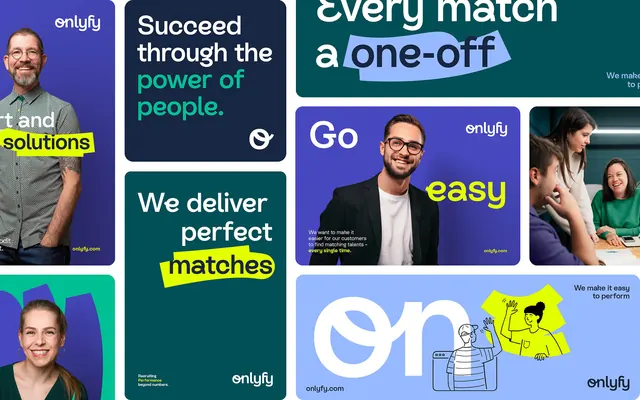
A collection of flat design cards mixing photography, typography, and branded messaging in teal, purple, and bright yellow.
Summary
A branded collage of six marketing cards for Onlyfy (a matching service) alternating photography, typography, and service messaging in teal, indigo, and neon yellow.
Visual description
A grid of two-tone cards arranged in a mosaic. Left column shows a man in glasses smiling against a bright purple background, labeled "Send Solutions" in yellow. Center cards present white text and icons on teal or indigo: "Succeed through the power of people" (white text, teal), "We deliver perfect matches" (white text with neon yellow highlight bar, teal), and an Onlyfy logo on pale blue. Right column repeats people photography on purple and teal backgrounds. Bottom row shows an illustrated character figure (teal lines on white) with "Go easy" in neon yellow, and an Onlyfy URL. Each card carries the Onlyfy logo and wordmark. The overall effect layers warm people-focused photography with cool brand messaging and bright yellow highlights.
Key takeaway
The pairing of candid photography (human, approachable) with bold neon-yellow typography (energetic, modern) balances friendliness and professionalism. Repeating the same few color blocks (teal, purple, blue, yellow) across cards creates unity. The yellow-highlight technique (stark contrast on dark backgrounds) draws the eye to key copy.
Reuse notes
Strong for SaaS and matching-service marketing (Onlyfy specializes in team matching and hiring). The photography + messaging card format works for any people-focused service. The purple and teal combination reads modern and tech-forward; neon yellow is high-impact but needs restraint to avoid overwhelm.
More like this



Keep what you find
A free account saves references to boards and can send you a weekly email of picks based on what you save.
To see every result, go Pro.