Preview image. Unlock full-res
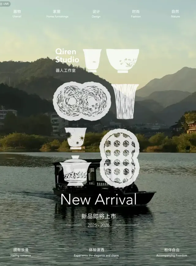
A porcelain product display webpage compositing white ceramic vessels and patterns over a hazy, stepped mountain landscape, with Chinese bilingual navigation and new arrival announcement.
Summary
A mobile-optimized product landing page for Qiren Studio ceramic collections, compositing illustrated white porcelain vessels and geometric patterns atop a misty, stepped mountain landscape and natural waterfront.
Visual description
The viewport is dominated by a hazy landscape backdrop showing stacked mountain silhouettes and a water body in the mid-ground, rendered in soft greens, greys, and beige. Overlaid in the center are four white ceramic objects: a flared rim bowl with radiating line patterns, a simple cylinder, a dotted pattern plate, and a textured vessel form. These are arranged in a loose, asymmetric vertical stack. A narrow horizontal band of navigation text appears at the very top in both Chinese and English (Qiren Studio, links, menu items). Large white sans-serif and display type floats below the product group: "New Arrival" in English with the Chinese equivalent "新品即将上市" (New products coming soon) and dates "2025-2026" beneath. The overall composition balances high contrast white objects against muted, cool landscape tones.
Key takeaway
The layered landscape backdrop creates a serene, gallery-like context for product display without competing with the objects. Compositing illustrated white objects on a photographic background gives depth and sophistication. The bilingual layout and top-aligned navigation establish a global, premium positioning. Muted color palette with high contrast white objects is effective for minimalist product photography reimagined as layout. The vertical asymmetric stacking of product forms is more dynamic than a grid.
Reuse notes
Strong approach for luxury ceramics, tableware, and home goods brands aiming for a refined, serene online presence. The landscape backdrop works well for regionally inspired collections or for contextualizing craft and natural materials. The white-on-muted-tone treatment is particularly effective on mobile. The asymmetric, composed stacking avoids grid formality while maintaining clear product focus. Consider for artisan or studio-based brands where the product narrative connects to natural or cultural geography. Best paired with high-quality product illustrations or photography.
More like this
Keep what you find
A free account saves references to boards and can send you a weekly email of picks based on what you save.
To see every result, go Pro.