Preview image. Unlock full-res
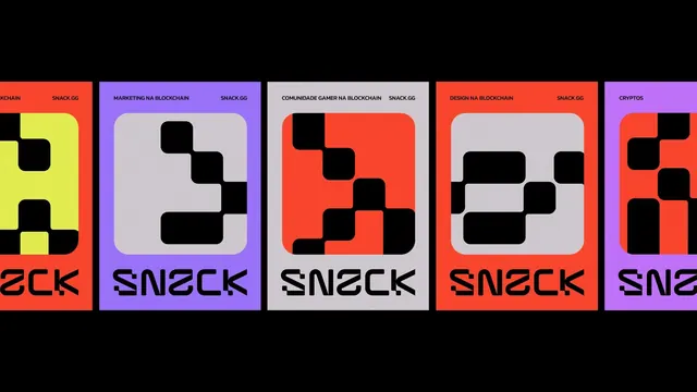
Horizontally stacked modular cards for blockchain and gaming services, each with a bold color header and abstract black geometric icon pattern.
Summary
Five horizontally aligned cards for SNACK.GG, a blockchain/gaming platform, each with a bold color header (yellow, purple, light-gray, red-orange, purple), all-caps service labels (BLOCKCHAIN, MARKETING, COMMUNITY, DESIGN, CRYPTOS), and black abstract geometric icons.
Visual description
Five repeating card modules arranged left-to-right against a black background. Each card has a colored top section with white all-caps text (service name + "SNACK.GG" branding), and a light-colored body section (light-gray or white) containing a black abstract geometric icon made from rounded corner squares. The icons vary in arrangement but repeat the same visual language. Color alternation cycles through neon yellow, purple, light-gray, coral red, and purple. Typography is tight, modern sans-serif in all caps. The overall effect is clean, tech-forward, and modular.
Key takeaway
The modular card system creates instant visual cohesion and scalability. The alternating bold header colors against neutral card bodies provide rhythm without overwhelming. The abstract geometric icons (negative space built from rounded squares) are simple yet distinctive and platform-identifiable.
Reuse notes
Strong foundation for crypto, gaming, or fintech product marketing where multiple services need unified presentation. The card module scales horizontally and could extend vertically. Works well when each card represents a service tier, feature, or integration partner.
More like this


Keep what you find
A free account saves references to boards and can send you a weekly email of picks based on what you save.
To see every result, go Pro.