Preview image. Unlock full-res
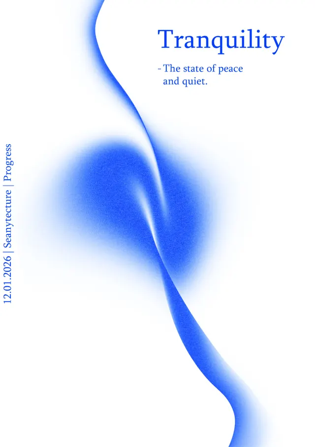
Vertical composition pairing a soft blue-to-white gradient organic form against a minimalist serif headline and subtitle, evoking calm and serenity.
Summary
A minimalist graphic anchored by a sweeping blue fluid form and a two-tier serif headline emphasizing serenity and inner peace.
Visual description
A vertical poster with a soft white background. The right side features a blue serif headline reading "Tranquility" in a large, elegant typeface, with a supporting line beneath it reading "The state of peace and quiet" in smaller text. The left and center are dominated by a flowing, organic blue gradient form that curves vertically down the composition. The form transitions smoothly from bright cobalt at top through varying shades of blue and blends into white, creating a sense of fluid movement. The left edge features vertical serif text reading "2026 Sanyecure Progress" in small type. The overall effect is tranquil and refined, with ample white space letting the organic form breathe.
Key takeaway
Use a single fluid organic form as a visual anchor while typography carries the conceptual weight. The gentle gradient-to-white fade creates depth and movement without excess. Pairing a large serif headline with a compact sans-serif description line creates visual hierarchy without visual clutter.
Reuse notes
Works for wellness, healthcare, meditation, and corporate brands seeking calm sophistication. The vertical format suits poster and digital presences. Ensure headlines have enough white space around them to maintain the minimalist clarity.
More like this




Keep what you find
A free account saves references to boards and can send you a weekly email of picks based on what you save.
To see every result, go Pro.