Preview image. Unlock full-res
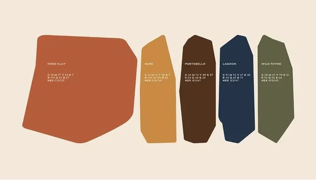
Five organic-shaped color swatches labeled with earthy paint names: fired clay, dune, portobello, lagoon, wild thyme.
Summary
Five organic-shaped color swatches in earthy hues, each labeled with descriptive paint-color names in small sans-serif type.
Visual description
Five irregular geometric shapes arranged horizontally across a neutral beige background. The leftmost swatch (fired clay) dominates the composition with a large rust-brown organic form. The remaining four are narrower and taller (dune, portobello, lagoon, wild thyme), progressing from golden-tan to dark brown to navy to muted olive. Each shape has small angular facets suggesting folded or three-dimensional paper. Label text in white caps sits near the top of each swatch, with color hex codes in tiny sans-serif below. The palette moves through warm earth tones into cool jewel tones, creating visual rhythm while staying strictly muted.
Key takeaway
The organic-shape approach to color swatch display breaks rigid grid layouts while staying legible. Labeling with both common names and hex codes bridges human and technical audiences. The size hierarchy (one dominant swatch plus four balanced companions) creates focal interest without hierarchy confusion.
Reuse notes
Strong for interior-design palettes, paint brands, craft materials, or design tokens that need warmth and approachability. Works well paired with product photography or in printed material. The organic geometry suits natural, lifestyle, or handmade brand voices more than corporate or technical ones.
More like this






Keep what you find
A free account saves references to boards and can send you a weekly email of picks based on what you save.
To see every result, go Pro.