Preview image. Unlock full-res
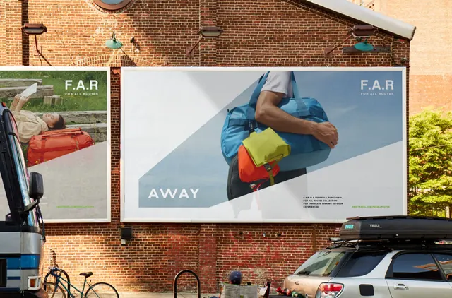
A large-scale outdoor advertisement mounted on aged brick, split vertically between a minimal logotype and a single product photograph, using high-contrast layout and bold sans-serif typography.
Summary
A street-facing billboard affixed to textured brick, divided into two halves: a bold "F.A.R." logotype on the left and a cropped lifestyle product image on the right, rendered in high-contrast white and muted earth tones.
Visual description
A large rectangular billboard is mounted flush against an aged, red-brown brick facade. The sign is divided vertically down the center: the left half displays white sans-serif typography (the word "F.A.R." in a geometric, bold font) set against a light gray or off-white background. The right half shows a cropped photograph of a blue or teal-colored product (appears to be apparel or sportswear) on a neutral background. Small text labels identify sections. The photo is shot tight, focusing on the object with minimal context. The surrounding brick, weathered and textured, creates visual interest and grounds the advertisement in a real urban environment. High contrast between the flat graphic on the left and the photographic image on the right draws the eye naturally through the composition.
Key takeaway
The 50/50 vertical split between typography and product image is direct and powerful, avoiding busy layouts. Setting the logotype in negative space (white on light) against the warm brick creates subtle sophistication. The cropped, tight product shot on the right feels contemporary and focused, suitable for both lifestyle and functional products.
Reuse notes
Strong for outdoor retail or product launch campaigns, especially in urban environments. The monolithic scale and simplicity work at distance (legible from the street). Pair with warm, aging materials (brick, steel, wood) for authenticity. Less effective in digital contexts where the large-format advantage is lost.
More like this



Keep what you find
A free account saves references to boards and can send you a weekly email of picks based on what you save.
To see every result, go Pro.