Preview image. Unlock full-res
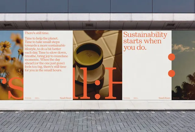
Multi-panel outdoor billboard campaign with overlapping typographic panels, photography, and orange accents promoting environmental action and sustainable living.
Summary
A multi-section outdoor billboard presenting stacked typographic panels and overlaid photography with orange accents, promoting sustainable action under the Small Hours brand.
Visual description
A large-scale billboard composed of four distinct sections mounted on a building exterior. From left to right: a sunflower photograph with orange type overlay reading "S" in an oversized display font; a secondary panel with small-point body copy in warm terracotta color describing sustainability action, headed "There's still time"; a central panel featuring a woven hat or natural object photographed at close scale with massive orange "IF" letters overlaid; and a right-hand section showing tropical palm foliage beneath white display type reading "Sustainability starts when you do" with two large orange circles as accent marks. The overall composition employs a restrained palette of whites, grays, terracotta, muted greens, and bright orange, with all typography set in a clean, modern sans-serif family. Small Hours branding appears in lowercase at the bottom of panels.
Key takeaway
The layering of photography beneath large-scale display typography, where the type and image interact rather than sit adjacent. The orchestration of a single warm accent color (orange) across multiple panels to unify a campaign. The mix of detailed photography and graphic simplicity, with negative space between sections preventing visual chaos at this scale.
Reuse notes
Strong for sustainability or nonprofit campaigns, environmental advocacy, or any messaging requiring emotional resonance with restraint. The billboard scale rewards bold typography and breathing room. Works well for multi-panel installations or sequential messaging across a physical space. The warm-dominant palette reads accessible and human-centered rather than corporate.
More like this



Keep what you find
A free account saves references to boards and can send you a weekly email of picks based on what you save.
To see every result, go Pro.