Preview image. Unlock full-res
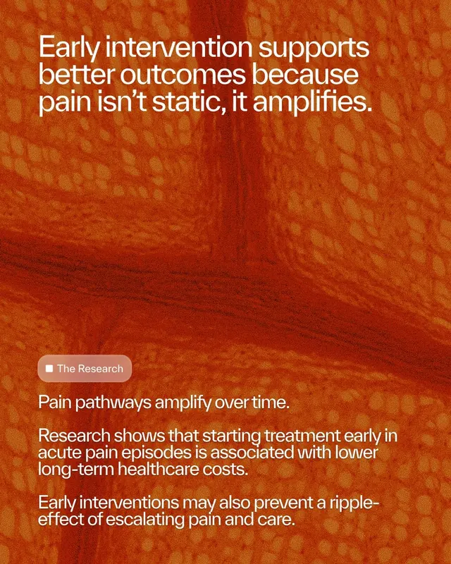
A medical research graphic with warm burnt-orange mottled texture background and white sans-serif text about early pain intervention.
Summary
A research-informed medical poster pairing warm burnt-orange mottled texture with crisp white headline and body text explaining early pain intervention outcomes.
Visual description
The background is an abstract, organic mottled pattern in burnt orange, rust, and terracotta tones, suggesting biological or dermatological subject matter. Overlaid in clean white sans-serif typography is a bold headline reading "Early intervention supports better outcomes because pain isn't static, it amplifies" positioned in the upper third. Below sits a gray rounded pill badge labeled "The Research," followed by two body paragraphs in smaller type describing pain pathway science and the cost-effectiveness of early treatment. The layout is left-aligned, giving the dense information an approachable, editorial feel despite the clinical subject.
Key takeaway
The organic texture background as a visual anchor for serious health content, the restrained color palette (three warm tones, white, gray) that reads both urgent and trustworthy, and the pill-badge device for section labeling without breaking hierarchy.
Reuse notes
Strong for healthcare, pharmaceutical, or pain-management communications. The warm palette feels more human and less sterile than cold blues, making research feel accessible. Works best when text has room to breathe; the two-column layout prevents wall-of-text fatigue.
More like this




Keep what you find
A free account saves references to boards and can send you a weekly email of picks based on what you save.
To see every result, go Pro.