Preview image. Unlock full-res
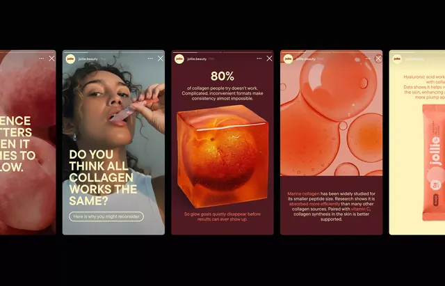
A series of skincare product marketing cards with 3D renders, bold copy, and high-saturation color blocking in warm orange and red tones.
Summary
A horizontal carousel of skincare product cards, each featuring a 3D-rendered product shot, scientific percentages or claims, and punchy short copy over contrasting color blocks in orange, red, and cream.
Visual description
A series of card panels, each roughly square, arranged in a continuous scroll. Each card combines: a top half with a large, luminous product render (bottles, spheres, or liquid elements in glossy close-up); a bottom half with color-blocked solid background (alternating deep red, burnt orange, or cream). Bold sans-serif type in white or dark text overlays the product or color blocks. One card shows "80%" in large type with explanatory copy below. Another reads "DO YOU THINK ALL COLLAGEN WORKS THE SAME?" in all-caps. The overall feel is modern cosmetics marketing with a scientific, premium tone. The color palette skips cool tones entirely, staying warm and earthy across all cards.
Key takeaway
Alternating solid color blocks behind similar visual elements to create rhythm in a series. Product 3D renders lit to appear almost luminous, with clear emphasis on texture and shape. All-caps, short-form copy questions that engage users. High contrast between warm earth tones and white type ensures readability and energy. The carousel format creates digestible individual cards while implying more content.
Reuse notes
Essential for skincare, cosmetics, wellness, and health supplement brands. Works especially well for claim-heavy or educational marketing (percentages, ingredient callouts, before/after). The 3D render style conveys premium positioning without looking retro. Best used in feed or carousel contexts where multiple cards appear. Pair with research citations or ingredient explanations below the fold. Keep copy short and punchy (one line per card). The warm palette works best for ingredients perceived as natural or energizing.
More like this








Keep what you find
A free account saves references to boards and can send you a weekly email of picks based on what you save.
To see every result, go Pro.