Preview image. Unlock full-res
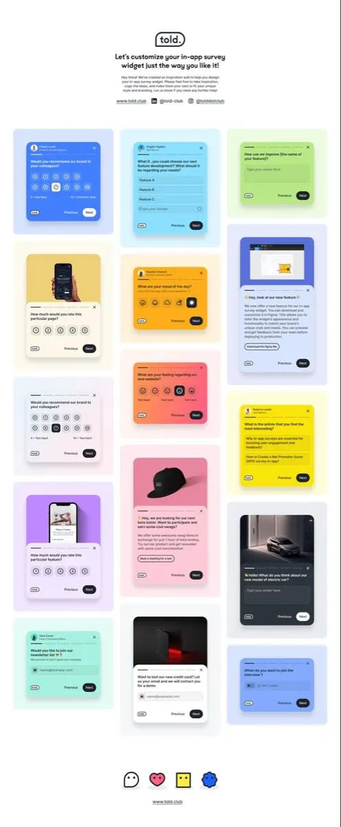
Design system documentation showing eight customizable survey and form card templates in a 3-column grid, each in a distinct bright color with minimal icons and call-to-action buttons.
Summary
Told is a customizable survey design system presenting eight distinct card templates in bright neon colors, each with question text, minimal icon rows, and navigation buttons.
Visual description
A grid layout of eight form card templates arranged in three columns on a white background. Each card occupies a distinct color block: electric blue, cyan, lime green, hot pink, coral orange, yellow, purple, and a dark navy-to-gray pair. Every card contains question text at the top (e.g. "Would you recommend...?", "What if...?"), followed by a row of minimal circle icons (representing response options), and a footer with link text ("told.club" / "good.ideas" / "@tolddesign") and two action buttons labeled "Previous" and "Next" (with "Next" in a solid dark pill and "Previous" in outlined/ghost style). At the top sits a header reading "Let's customize your in-app survey widget just the way you like it!" with descriptive subtext and three navigation links. At the bottom are four emoji-style reaction icons (neutral face, heart, sticky note, globe). The overall impression is a highly organized, accessible component library designed to showcase survey customization options.
Key takeaway
The color-coding system that gives each card visual distinctiveness while maintaining consistency through identical component structure. The icon-based response pattern is accessible and space-efficient. The dual-button footer (Previous/Next) with consistent styling creates a predictable interaction model. The centered grid presentation effectively demonstrates systematic design patterns without overwhelming the viewer.
Reuse notes
Strong reference for design-system documentation, product demos, and SaaS tool landing pages. The neon color-blocking technique is effective for showing the breadth of customization options. Works best when the point is to demonstrate a component library or configurability. The minimal icon approach assumes icons are self-explanatory (reaction-style or semantic); pair with actual icon definitions if legibility is critical.
More like this
Keep what you find
A free account saves references to boards and can send you a weekly email of picks based on what you save.
To see every result, go Pro.