Preview image. Unlock full-res
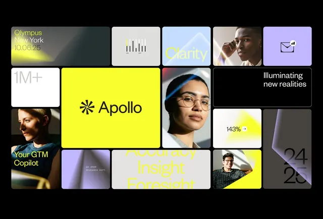
A high-contrast modular grid showcasing diverse product and brand modules in neon yellow, lavender, and black with mixed imagery and typography.
Summary
A bento-grid product showcase against a black background mixing neon yellow modules, lavender accents, portraits, iconography, and data visualizations in a structured 5-column layout.
Visual description
Black canvas divided into an irregular modular grid. Top row: soft-focus gradient "Olympus New York 10.06.25" event card in muted teal, white card with vertical bar chart icon, light blue "Clarity" card with mountain landscape, portrait photo of person, lavender card with outline envelope icon. Center: large neon yellow card with bold black asterisk and "Apollo" wordmark, stretching two rows; adjacent portrait of person with glasses against gradient; black card with white sans-serif "Illuminating new realities"; small white card showing "143%" in large digits with yellow highlight. Bottom row: white "1M+" stat card, portrait of person against gradient with yellow "Your GTM Copilot" label, lavender card with Q2 2025 text, white "Accuracy Insight Foresight" headline in neon yellow, yellow card with portrait and "24, 25" date stamp. Typography is crisp sans-serif in black, white, and yellow. Every card has rounded corners.
Key takeaway
The strict black background making neon yellow read with high energy without color noise. The three-to-four card widths enforcing rhythm across heterogeneous content (text, photos, icons, stats). The yellow module positioning (center-left, large) serving as a visual anchor that the eye returns to. Using single accent colors (yellow, then lavender as secondary) across many modules rather than a full palette per card.
Reuse notes
Strong foundation for SaaS product showcase, financial dashboards, or tech event teasers where you need to compress many disparate concepts into one frame. The grid system adapts to variable content (portraits, data, logos, headlines) without losing coherence. The neon yellow holds attention but can feel startup-heavy, so pair with professional serif typography or restrained imagery if the audience is enterprise. Lavender as a secondary accent is sophisticated rather than playful.
More like this





Keep what you find
A free account saves references to boards and can send you a weekly email of picks based on what you save.
To see every result, go Pro.