Preview image. Unlock full-res
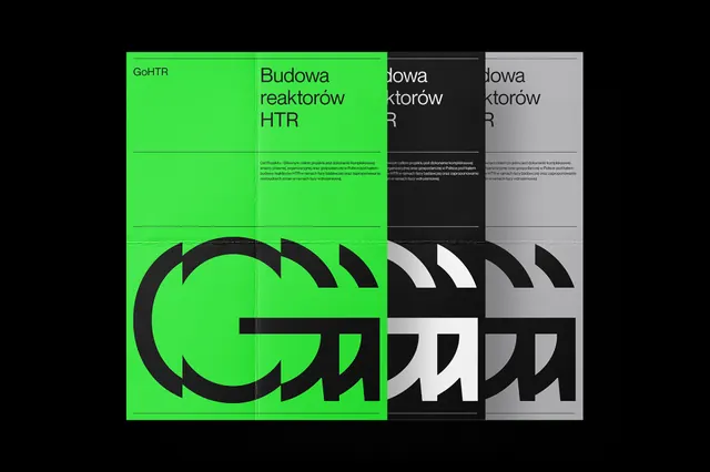
Four vertical color-blocked panels (bright green, green, black, light gray) with oversized 'CH' letterform and Polish technical copy about nuclear reactor research.
Summary
Four vertical color-blocked panels (bright green, green, black, light gray) with oversized 'CH' letterform and Polish technical copy about nuclear reactor research.
Visual description
Four equal-width vertical panels: leftmost is bright lime green; second is darker forest green; third is black; fourth is light gray. All against a black outer border. Each panel contains Polish text in white sans-serif, all-caps for headers ("BUDOWA REAKTORÓW HTR" and location details). The dominant visual element is a massive black geometric 'CH' letterform that spans across the left two panels (green and green-to-black transition), creating a bold visual anchor. The letterform uses sharp, angular strokes suggesting constructivist or brutalist design language. Text hierarchy is strict: all-caps headers, smaller body copy, even kerning. The overall effect is austere, clinical, and assertively technical without decoration.
Key takeaway
Monochrome letterform overlaid on color-blocked zones creates drama and legibility simultaneously. Hard left-to-right color progression (bright to black to gray) emphasizes information zones without visual noise. Oversized single-letter anchor in high-contrast color supports brand identity while maintaining severe professionalism.
Reuse notes
Suits technical, institutional, or research-heavy communications (energy, engineering, scientific). The bright green accent reads as urgent on the black background; use sparingly to avoid fatigue. Works at large scale (posters, signage); smaller contexts risk letterform illegibility. Pair with strict grid typography and all-caps treatment for cohesion.
More like this

Keep what you find
A free account saves references to boards and can send you a weekly email of picks based on what you save.
To see every result, go Pro.