Preview image. Unlock full-res
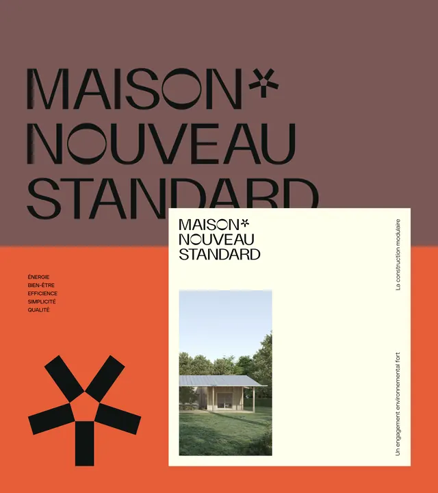
A design system poster pairing an oversized sans-serif wordmark with a geometric plus-sign symbol and a centered architectural photograph on a bold color-blocked background.
Summary
A design system poster pairing an oversized sans-serif wordmark with a geometric plus-sign symbol and a centered architectural photograph on a bold color-blocked background.
Visual description
A two-panel layout: the left half is a burnt-orange rectangle containing a black geometric cross/plus symbol made from five angled rectangles radiating from a center point; the right half splits vertically between a mauve background (top, background) and more orange (bottom, background). Large sans-serif typography spelling "MAISON* NOUVEAU STANDARD" floats across both halves in dark gray or black, extending into the mauve area. A cream-colored card or frame sits in the upper right with the wordmark repeated in smaller text, below which is a centered photograph of a minimalist white residential structure with green surroundings. Vertically rotated text runs down the right edge of the image. A list of French words ("BRUT EN FIBRE EFFICIENCE SYMBIOTE QUALITE") appears in small text on the orange section.
Key takeaway
The directness of the geometric symbol (five interlocking rectangles forming a dynamic cross) as a memorable brand mark. The clear information hierarchy using negative space and restricted color blocking. The integration of architectural photography as proof of real-world application, not just an aesthetic flourish.
Reuse notes
Strong template for design system or standards documentation, especially in architecture, construction, or premium brands. The mauve and burnt-orange palette reads sophisticated and somewhat unexpected, avoiding the usual corporate blues and grays. Works at poster scale; smaller applications might need tighter letter spacing.
More like this






Keep what you find
A free account saves references to boards and can send you a weekly email of picks based on what you save.
To see every result, go Pro.