Preview image. Unlock full-res
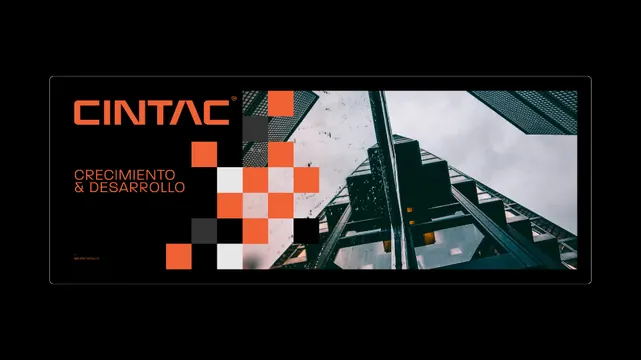
Brand identity composition blending a pixelated orange and white checkerboard pattern with industrial architecture photography.
Summary
A corporate identity composition for CINTAC featuring a pixelated checkerboard that morphs into architectural photography, with the brand name in large orange sans-serif.
Visual description
Horizontal layout anchored left by the brand name CINTAC in bold, oversized orange sans-serif with smaller supporting text beneath. A dynamic geometric grid of orange, white, and gray pixelated squares occupies the left-center, arranged in a checkerboard pattern that creates a sense of fragmentation or digital decay. This pattern transitions rightward into a cropped architectural photograph of industrial metal structures and concrete against a cloudy sky, the two halves connected through shared color and visual momentum. Deep black frame and teal-green accents ground the composition. Asymmetrical balance between clean typography and raw geometric/photographic content.
Key takeaway
The checkerboard-to-photograph transition uses the pixel pattern as a bridge between corporate identity and raw materiality, making the connection between branding and the built world literal. The color discipline (orange + teal + black) makes the shift feel intentional rather than chaotic.
Reuse notes
Strong for construction, industrial, architecture, or engineering brands wanting to project both precision and authenticity. Works best at billboard/poster scale where the photography and pixel pattern can breathe. The high contrast reads at distance; the pixelated effect requires clarity so test on the actual output medium.
More like this







Keep what you find
A free account saves references to boards and can send you a weekly email of picks based on what you save.
To see every result, go Pro.