Preview image. Unlock full-res
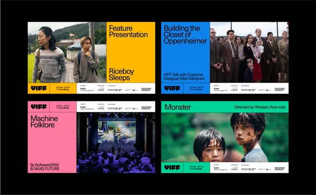
A six-panel promotional grid for VIFF film festival featuring bold color blocking, bold sans-serif typography, and photographic imagery with consistent footer branding.
Summary
A promotional grid for VIFF film festival organized in a 2x3 panel structure, each film title occupies one card with color-coded backgrounds, photographic stills, and consistent sans-serif branding footer.
Visual description
The layout is a 2x3 grid of film promotion cards on a black background. Top row: a nature photograph with two figures (yellow card with dark type), a headshot photo (blue card), and a group photo (white/cream card). Middle row: a pink card with minimal text, a dark interior photograph, and a green/teal card with close-up faces. Each card displays the film title (black or white sans-serif), credits, and a consistent VIFF logo with footer baseline. Color palette alternates: yellow, blue, white, pink, dark blue/teal, and green, creating visual rhythm and distinct project separation.
Key takeaway
The grid structure enforces portfolio consistency while color-blocking per card makes individual projects scannable. Consistent footer placement (VIFF branding at baseline) unifies heterogeneous imagery. The alternating saturated colors define project identity without additional graphic elements.
Reuse notes
Effective for film, creative, or studio portfolios where distinct projects need visual hierarchy yet cohesion. Works well for festival or gallery promotion grids where thematic imagery varies per card. Requires strong photography to carry each cell; works best with 2-3 column layouts.
More like this



Keep what you find
A free account saves references to boards and can send you a weekly email of picks based on what you save.
To see every result, go Pro.