Preview image. Unlock full-res
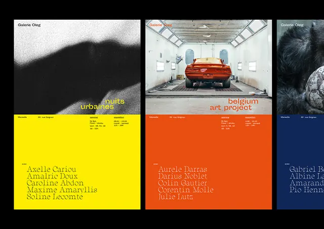
A stark exhibition layout balancing moody black-and-white photography, bold color-blocked text panels in yellow and orange, and a restrained sans-serif hierarchy.
Summary
An exhibition layout that juxtaposes austere monochromatic photography with bold color-blocked text panels in yellow and orange to create visual and conceptual tension.
Visual description
A three-panel grid composition: the left and right panels show moody, contrasty black-and-white photography (urban landscape, parked car in bright light, stormy sky), while the center panel pairs high-contrast type over a bright yellow background with a large orange block below. The sans-serif typography is set in all-caps, arranged to balance the geometric solidity of the colored fields. The palette is limited and decisive: black, white, yellow, orange, with hints of grey. The overall effect is austere and contemporary, with the photograph's documentary quality offset by the abstract color statement.
Key takeaway
The extreme contrast between raw photographic content and pure color abstraction creates a sophisticated visual dynamic. Using two complementary warm colors (yellow and orange) alongside black-and-white photography feels energetic without becoming chaotic. The grid structure provides stability while the color blocking injects visual drama.
Reuse notes
Effective for art institutions, design studios, or editorial brands that need to project both rigor and visual boldness. The tight, restrained palette works especially well for exhibition identity, poster campaigns, or typographic systems. Not suitable for brands needing warmth or approachability; best for serious, contemporary voices.
More like this
Keep what you find
A free account saves references to boards and can send you a weekly email of picks based on what you save.
To see every result, go Pro.