Preview image. Unlock full-res
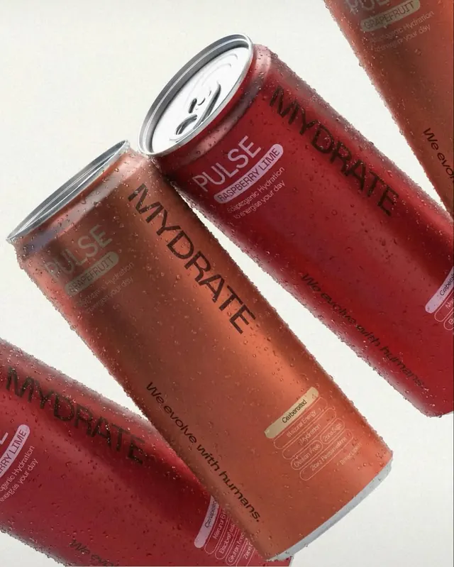
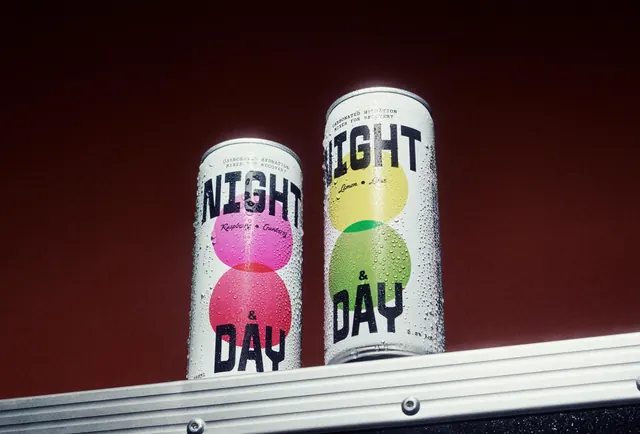
Product mockup of mineral-enriched functional drink cans in deep red and burnt orange with gradient labeling, photographed at an angle with water droplets and metallic rim detail.
Summary
Product photography of three functional beverage cans in burnt orange and deep red with mineral/supplement labeling, angled to showcase metallic rim detail, gradient label design, and water-beaded condensation texture.
Visual description
Three aluminum cans arranged diagonally against a cream background. Left can in rust orange with black sans-serif "HYDRATE" text and secondary copy. Center can in deep red with white "PULSE" labeling. Right can partially visible in burgundy red. Each can features a prominent white metallic rim band and a gradient label design that shifts in tone across the can body. Text treatment includes technical product copy (ingredients, benefits) in small sans-serif at the bottom of each can. Water droplets and condensation visible on all surfaces, indicating refrigeration. Cans overlap to create depth and show the cylindrical form in perspective. Lighting is soft with subtle shadows to emphasize form.
Key takeaway
The gradient label that shifts from one warm tone to another creates visual hierarchy and directs the eye without bright contrasts. The metallic rim and water beading convey product freshness and quality through realistic material detail. Three-can diagonal arrangement builds compositional momentum while showing color variation without redundancy. Typography layering (bold product name plus technical specs) balances consumer appeal with functional credibility.
Reuse notes
Strong for beverage, supplement, and wellness product launches. Works best when you have 2-4 complementary colors that read as a flavor or function family. Requires high-quality product photography (soft lighting, clean surface, visible material texture). The water-droplet effect signals freshness or hydration; apply carefully to categories where it's contextually true. Label typography must maintain legibility even at smaller angles on the curved form.
More like this

Keep what you find
A free account saves references to boards and can send you a weekly email of picks based on what you save.
To see every result, go Pro.