Preview image. Unlock full-res
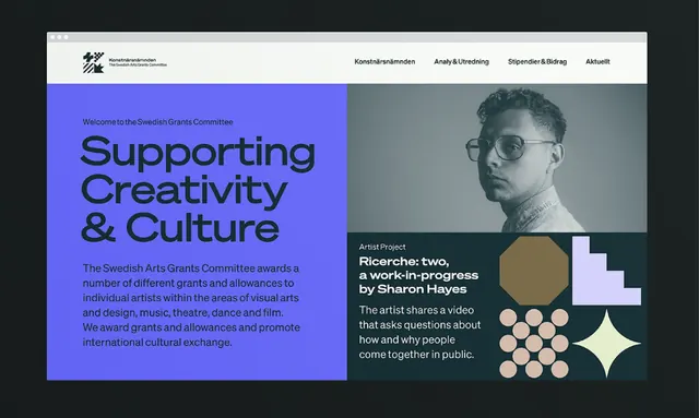
Split-page design for a cultural grants program using deep blue, cool teal, and cream with geometric elements and typographic hierarchy.
Summary
A promotional layout for a nonprofit arts grants program, featuring a bold left panel in deep blue with large white headlines, and a right panel with a portrait photo, small icon dots, and geometric shapes in cream and teal.
Visual description
The design is split vertically. Left side: saturated cobalt blue background with bold sans-serif headlines reading "Supporting Creativity & Culture" in white, then "The Swedish Arts Grants Committee awards..." in body copy. Top-right logo and navigation. Right side: cream-colored field with a black-and-white portrait photograph of a man in glasses, overlaid with geometric elements including a tan circle, scattered cream and teal dots, and a white four-pointed star shape. Small body text describes a grant project and asks "how will you come together in public." Accent color of soft gold appears in details.
Key takeaway
The split color-blocking approach creates immediate visual interest without imagery on the left; the right side demonstrates how geometric elements (dots, circle, star) can add visual texture without clutter; the deep blue conveys institutional trust while the cream and teal relieve severity; the dense sans-serif typography combined with spacious negative space achieves authority without coldness.
Reuse notes
Ideal for nonprofits, government agencies, and cultural institutions seeking a modern, serious aesthetic. Works especially well for programs around funding, grants, or calls to action. The cool color palette reads as more institutional than warm alternatives; avoid if you need friendliness or approachability. The geometric accents are restrained enough to work in print and digital. Best paired with strong portrait photography on the secondary side.
More like this



Keep what you find
A free account saves references to boards and can send you a weekly email of picks based on what you save.
To see every result, go Pro.