Preview image. Unlock full-res
Bright lime-green app interface paired with iOS notification card mockup, establishing a high-contrast system language for a service marketplace platform.
Summary
Bright lime-green app icon paired with iOS notification card mockup, establishing a high-contrast system language for a service marketplace platform.
Visual description
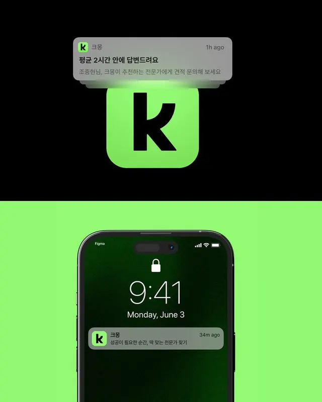
A vertical composition showing two interface states against black background. Top half displays a rounded-square lime-green app icon with black "K" letterform, accompanied by a gray notification card with Korean text and "1h ago" timestamp. Bottom half shows an iPhone lock screen mockup with the same lime-green dominant color and a darker green background, displaying the time 9:41 and another notification from the same app at the bottom of the screen. The color palette is highly reduced: bright neon lime-green (#92F972) against black and neutral grays, creating stark visual separation. Sans-serif typography throughout.
Key takeaway
The idea of using a single neon color accent against pure black and neutral backgrounds to create a system that reads instantly at small sizes (icon state) and maintains cohesion across multiple UI surfaces (notification, lock screen). The notification card treatment shows how to apply the same color language to inline messaging. The rounded corners and geometric icon form work together to project friendliness while the stark black background preserves professional distance.
Reuse notes
Strong reference for mobile-first service platforms, marketplaces, or consumer apps needing a punchy, energetic visual identity that works at multiple scales and screen states. The high contrast approach ensures legibility in busy notification centers and makes the app recognizable at icon size. Limit reuse to tech-forward or gig-economy categories where energy and modernity signal trust.