Preview image. Unlock full-res
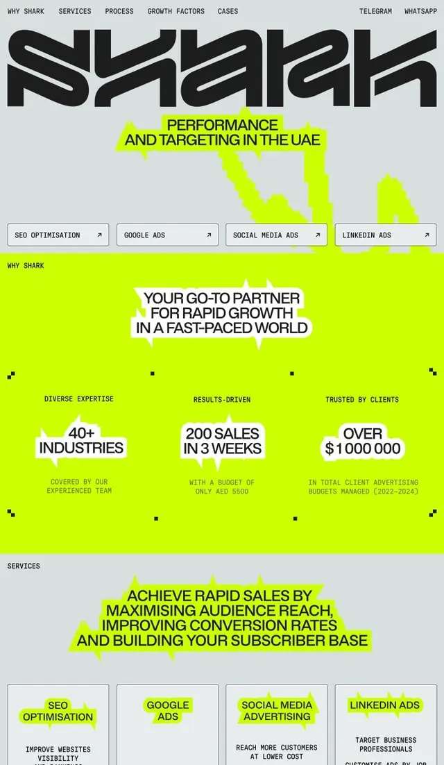
Service landing page for an independent ad-placement platform using lime green accents and numbered feature sections to structure the narrative.
Summary
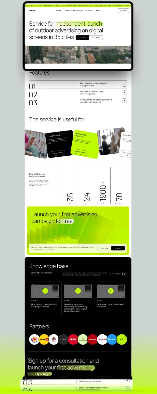
Landing page for an outdoor ad network showing hero with live city image, numbered feature sections, partner logos, and a lime green call-to-action banner.
Visual description
Full-page vertical mockup starting with a navigation bar and hero section containing a real cityscape photograph, headline in dark and lime-green type, and a "Learn More" button. The hero is framed in rounded-corner white container. Below, three numbered features (01, 02, 03) as expandable accordion cards with descriptive copy. Next is a "The service is useful for" section with four illustrated use-case cards laid in a grid, each showing different ad formats. A large statistics block displays metrics (35, 24, 1900+, 70) with labels. A lime green banner section with white text reads "Launch your first advertising campaign for free" with a CTA button. A dark section labeled "Knowledge base" shows three white-on-black content cards with lime green accent dots. A "Partners" row displays colorful client logos. The layout closes with another lime-green banner for sign-up. Consistent white space and sans-serif typography throughout support clarity and scanability.
Key takeaway
The numbered accordion structure (01, 02, 03) for breaking features into digestible, clickable sections. The lime green color applied strategically (banner backgrounds, accents, dots) to energize an otherwise neutral palette. The alternating dark and light section backgrounds creating rhythm and section distinction. Partner logos in a tight horizontal row building credibility without noise.
Reuse notes
Effective template for B2B SaaS landing pages, especially service platforms. The numbered-feature pattern works well on mobile. The two-color constraint (green plus black/white/gray) keeps the design simple and maintains focus on functionality over decoration.