Preview image. Unlock full-res
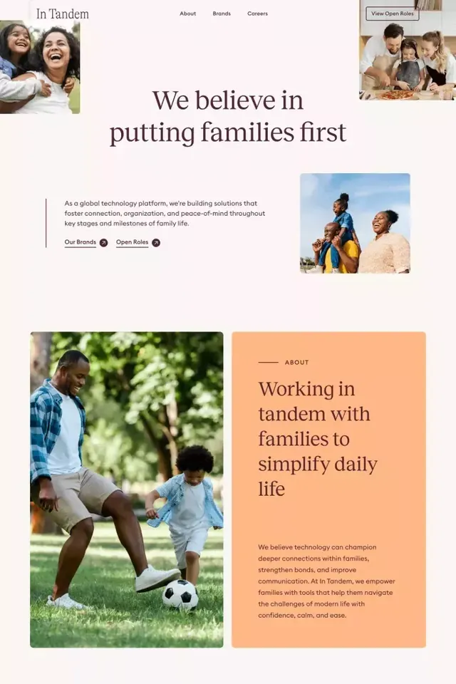
Family-tech product page split into asymmetric blocks mixing large photography, serif headlines, peach accent panels, navigation, and call-to-action buttons with warm, earthy tones.
Summary
A family tech platform landing page arranged as stacked, asymmetric blocks: serif headline statement, white-space split layout with photography and button links, warm peach content panel with narrative text, and mixed imagery celebrating family moments.
Visual description
A light pink background frames five distinct content blocks stacked vertically. Top section: navigation bar (In Tandem, About, Brands, Careers), small inset photos top-left and top-right (smiling family moments), and center: large serif headline "We believe in putting families first" in dark brown with sub-copy introducing the brand mission. Middle section: split layout with white space left, a light-gray call-to-link "View Open Roles" button top-right, two secondary navigation links (Our Brands, Open Roles, each with a count badge). Large serif subheading "Working in tandem with families to simplify daily life" in dark brown on a warm peach background panel, followed by narrative copy in a complementary serif face. Bottom two blocks: a left image of a man and child playing soccer in a green outdoor setting, and a right image of a woman holding a child in bright outdoor light, with no additional copy but implying testimonial or family-focused outcomes. Throughout, white space separates blocks clearly.
Key takeaway
The pairing of serif display headlines with clean sans-serif body text for a warm but professional tone. The peach accent block as a distinct narrative layer that breaks the white-space rhythm. The asymmetric image placement (left/right alternation) creates visual momentum down the page while remaining legible and unhurried.
Reuse notes
Excellent for family-focused consumer products, parenting platforms, and social-impact brands targeting parents or caregivers. The warm earthy palette reads trustworthy and human without being cutesy. Works well when you have compelling photography of real families; the block structure allows that imagery to breathe. Avoid if your product is technical or B2B-only; this layout emphasizes connection and lifestyle over features.
More like this



Keep what you find
A free account saves references to boards and can send you a weekly email of picks based on what you save.
To see every result, go Pro.