Preview image. Unlock full-res
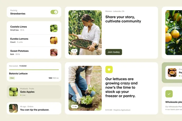
Farm-to-consumer app interface combining a product list with lifestyle photography, emphasizing local sourcing and community engagement.
Summary
Produce-delivery app interface combining a left sidebar product list with a right-side hero section featuring a farmer in the field, emphasizing trust and direct sourcing.
Visual description
The layout is a multi-column card-based interface on a warm beige background. Left column: a scrolling list of produce cards, each with a product photo square, product name in bold sans-serif, quantity details in smaller type (e.g. "Small box - 10 lb"), and a small crop photo thumbnail. Center column: lifestyle photography of a farmer in white shirt holding a harvest basket, layered with a bold headline "Share your story, cultivate community" and a dark green CTA button. Right column: additional product photos (lemons, citrus on branch) and context cards. Overall color palette is warm whites, soft browns, soft greens, and deep olive accents. Ample white space separates cards; all type is clean sans-serif in grey or black.
Key takeaway
The pattern of pairing a structured product list with a lifestyle hero image to build emotional connection without sacrificing scannability; the use of small square product thumbnails as both functional and visual anchors; the warm, earthy palette creating trust for a farm brand without feeling rustic or unprofessional.
Reuse notes
Ideal for food and agriculture app design, farmers-market platforms, CSA subscriptions, or any consumer-facing supply chain where transparency and local sourcing are selling points. The card-based layout adapts well to mobile-first design. The photography style (bright daylight, hands-on work) reads as authentic and human; pair with brands that emphasize values like sustainability or direct producer relationships.
More like this



Keep what you find
A free account saves references to boards and can send you a weekly email of picks based on what you save.
To see every result, go Pro.