Preview image. Unlock full-res
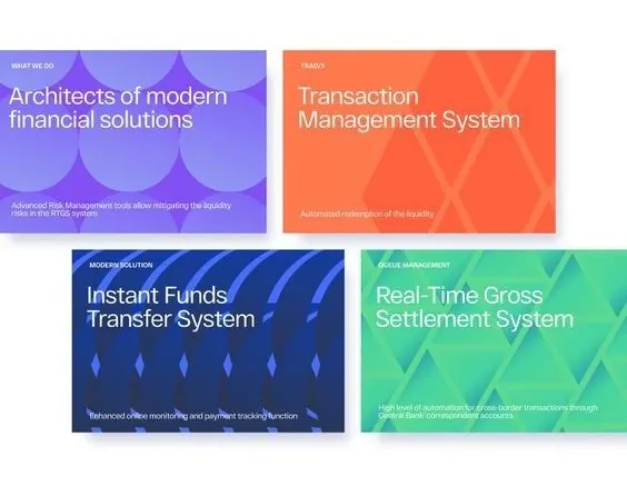
Four-card grid introducing fintech products with repeating wave motifs, each in a distinct bright color block with white sans-serif type.
Summary
A four-card layout for fintech services, each panel colored in a different hue, with repeating diagonal wave patterns and structured white typography.
Visual description
Four equal rectangular cards arranged in a 2x2 grid. Top-left card in lavender-purple with lighter purple diagonal waves; top-right in bright coral-orange with darker orange wave forms. Bottom-left in deep navy with lighter blue wave patterns, bottom-right in bright mint-green with lighter teal waves. Each card contains a small header badge ("WHAT WE DO", "PRODUCT", "MICROSERVICE", "ASSET MANAGEMENT"), an all-caps sans-serif headline in white (e.g. "Instant Funds Transfer System", "Real-Time Gross Settlement System"), and 1-2 lines of fine-print explanatory text in white. The repeating wave forms create visual rhythm while the bright color blocking ensures immediate content differentiation across the four products.
Key takeaway
The wave pattern repeats consistently within each color space, providing visual texture without competing with type. The color isolation is decisive - each card owns its own hue spectrum, making the grid instantly scannable. The typographic hierarchy (badge, headline, description) remains legible against the bright backgrounds through weight and size, not color manipulation.
Reuse notes
Strong template for fintech or regulated-industry product offerings where clarity and trustworthiness matter. The modular card system scales from 2-4 items easily. Works best when all cards carry similar copy length to keep the grid aligned. The wave patterns suggest motion and flow, fitting for banking/payment contexts; avoid if you need a more austere or minimal aesthetic.
More like this




Keep what you find
A free account saves references to boards and can send you a weekly email of picks based on what you save.
To see every result, go Pro.