Preview image. Unlock full-res
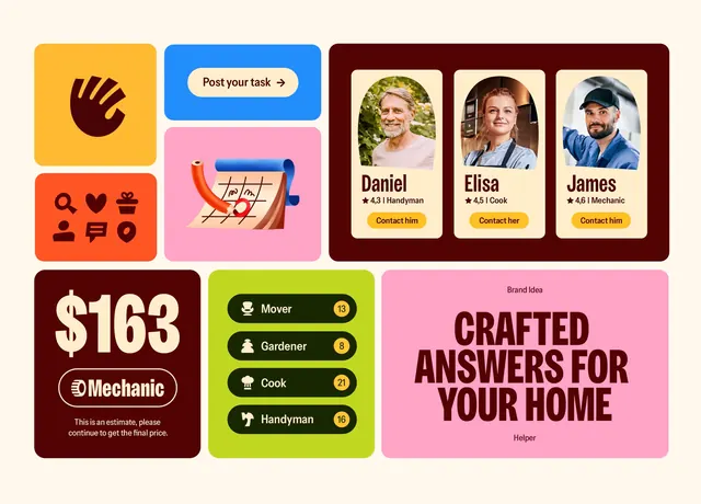
Colorful card-based UI showing a home services marketplace with bright block colors, icon labels, and testimonial headshots organized in a flexible grid.
Summary
A marketplace interface showcasing home services and service providers through colorful rectangular cards with icons, text labels, pricing, testimonials, and call-to-action buttons.
Visual description
Grid layout on cream background with eight cards arranged in four rows of two. Top-left: yellow square with large red-line gesture icon and label. Below it: orange square with heart, dollar, and settings icons stacked vertically. Third row left: dark maroon rectangle showing "$163" in bold white with Mechanic branding and small text. Fourth row left: neon-green square with four stacked toggle switches labeled Mover, Gardener, Cleaner, Handyman. Top-right: blue pill-shaped button with white text "Post your task". Second row right: pink card with shopping-cart icon and wavy graphic. Third row right: dark maroon frame with three circular headshots of people labeled Daniel, Elisa, and James, each with star ratings and "Mechanics" subtitle. Bottom-right: bright pink card with large dark magenta text reading "CRAFTED ANSWERS FOR YOUR HOME" and a smaller "Expertise" label. Cards use flat color fills with sharp edges, no shadows or gradients. Sans-serif typography in varying weights and sizes anchors each section.
Key takeaway
The color-blocking creates visual interest without needing images; each hue communicates a different service or function. Mixing card sizes (large testimonials, small toggles, wide labels) makes the layout feel organic and explorable. The icon-first labeling approach scales to many service categories at a glance.
Reuse notes
Ideal for gig marketplaces, home-service platforms, or task-listing apps. Works when color mapping aligns with category meaning (green for utilities/eco, orange for urgency, maroon for expertise). Can feel cluttered if more than 8-10 cards are shown at once; consider pagination or filtering by category.
More like this




Keep what you find
A free account saves references to boards and can send you a weekly email of picks based on what you save.
To see every result, go Pro.