Preview image. Unlock full-res
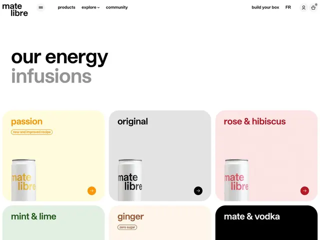
E-commerce product showcase featuring six Mate Libre drink variants in a 2x3 grid, each in a pastel-colored rounded card with flavor name and product can.
Summary
E-commerce product grid displaying six Mate Libre drink flavors in pastel-colored rounded cards, each with a flavor name, product can image, and navigation arrow.
Visual description
A full-width product showcase with a navigation header at the top (Mate Libre logo, products/explore/community links, user account and cart icons in black sans-serif). The main headline "our energy infusions" spans two lines in bold and light weights, left-aligned. Below, a grid of six product cards in a 2 columns by 3 rows layout. Each card is rounded with a flat background color: pale yellow (passion), light gray (original), soft pink (rose and hibiscus), mint green (mint and lime), beige (ginger), and solid black (mate and vodka). Each card shows the Mate Libre can with brand color matching the card background, a flavor name in a matching or contrasting color, and a circular arrow icon in the lower right. The entire layout sits on a clean white background with generous whitespace around the content area.
Key takeaway
The color-per-flavor system where each card's background echoes the drink's flavor descriptor without becoming garish, achieved through careful pastel saturation. The consistent rounded-card grid and the repeated arrow-button gesture create navigational rhythm that encourages exploration of variants.
Reuse notes
Essential template for beverage, confectionery, or multi-variant product launches. The 2x3 grid is particularly mobile-friendly and scales to 3 columns on desktop. Works well when each variant has a visually distinct personality (color-coded flavors); becomes repetitive if all cards are the same shade. Include a variant tag (new, zero sugar) when available, as shown in the ginger card, to highlight secondary differentiators.
More like this
Keep what you find
A free account saves references to boards and can send you a weekly email of picks based on what you save.
To see every result, go Pro.