Preview image. Unlock full-res
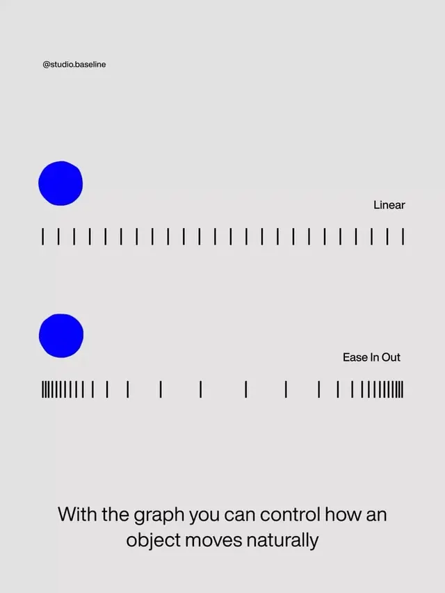
Educational motion design diagram showing linear versus ease-in-out animation curves using blue circles and vertical tick patterns.
Summary
Educational diagram explaining animation easing by comparing linear motion (evenly-spaced tick marks) to ease-in-out motion (clustered tick marks) using identical blue circles.
Visual description
Light gray background with vertical stacked layout. Credited to @studio.baseline at top. Two identical rows, each containing a bright blue circle on the left and a horizontal sequence of short black vertical lines extending to the right, with a label on the far right. Top row labeled "Linear" shows evenly-spaced vertical tick marks. Bottom row labeled "Ease In Out" shows tick marks clustered densely at the start, widely spaced in the middle, then clustered densely at the end, visualizing acceleration and deceleration. Body text at bottom reads "With the graph you can control how an object moves naturally". All typography in clean sans-serif, black on light gray.
Key takeaway
The use of position-over-time visualization through repeated elements (tick marks) to convey motion principles. The side-by-side comparison allowing direct contrast between linear and eased motion without animation. The explicit educational caption anchoring the concept in readable language.
Reuse notes
Essential reference for animation software documentation, interaction design guidelines, or educational content about motion principles. Works equally well for print or screen-based technical documentation.
More like this



Keep what you find
A free account saves references to boards and can send you a weekly email of picks based on what you save.
To see every result, go Pro.